Supported Versions
SOLIDWORKS
SOLIDWORKS 2023, 2024 and 2025 are fully supported.
Microsoft Windows
Microsoft Windows 10 and 11 are fully supported.
Scalability
Continual development to support the management of an enterprise wide deployment.
DriveWorks Pro Server
DriveWorks Pro Server has been re-designed as a browser based utility.
All existing functionality has been maintained but this now gives additional benefits, including:
Learn moreIntegration Theme Quick Start
Instantly launch the Integration Theme site in a browser.
The Integration Theme no longer requires modifying the DriveWorksConfigUser.xml file, or modifying the served static files to see the site in a browser.
Learn moreIntegration Theme - Live UI
Integration Theme site settings are administered directly in the browser.
Quickly and easily set up, customize and use the Integration Theme.
Learn moreEmail Authentication
DriveWorks applications that send emails allow Exchange Online (Microsoft 365) configuration.
Exchange Online supports sending emails via OAuth 2.0, Microsoft's recommended authentication method after the deprecation of basic authentication.
This allows secure, token-based authentication without exposing user credentials.
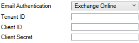
Exchange Online Email Authentication is supported in the following modules:
DriveWorks License Management
The License Manager includes the following enhancements to make returning and repairing licenses more efficient.
Fixed Licenses
- Return and Repair directly from the Fixed Licenses tab of DriveWorks License Management. Learn more.
- Return multiple Fixed Licenses together. Learn more.
- Repair Selected Fixed Licenses that have become untrusted. Learn more.
- Repair All Fixed Licenses that have become untrusted. Learn more.
Network Licenses
- Repair All Network Licenses that have become untrusted. Learn more.
DriveWorks Live Licenses
- Return and Repair directly from the DriveWorks Live tab of DriveWorks License Management. Learn more.
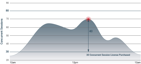
DriveWorks Live Insights License
The DriveWorks Live Insights license enables session tracking to monitor the usage of DriveWorks Live licenses.
This allows peaks in sessions to be identified to make informed decisions on where additional Live licenses could be beneficial.
This license type is available to work alongside a DriveWorks Live Centralized License.
Learn moreDriveWorks 3D
Improvements to make interactive 3D visualizations, for the desktop and web, realistic and performant
Undo/ Redo
Any changes made, while in the 3D Document editor can be reverted and reapplied using the undo and redo command buttons or shortcut keys.
DriveWorks 3D File - Command BarTone Mapping
The default value of the Environment's Tone Mapping Type property is ACES for newly created DriveWorks 3D Documents.
Environment Settings - Color AdjustmentsRule Revision History
DriveWorks 3D Documents will store previous versions of a rule, once a rule has been applied and then subsequently changed.
Rules Builder RevisionsSpot Light Entity
The default value of the Spot Light entity's Falloff Start Angle is now 115, and 138 for the Falloff End Angle when a new Spot Light entity is added.
Spot Light EntitySpecification Test Mode Support
Fully analyze every rule in a DriveWorks 3D Document that is displayed in a 3D Preview Control.
Specification Explorer Test ModePBR Advanced Render Property
PBR Advanced introduces a clearcoat layer to the PBR material.
Clearcoat enables the reproduction of a clear coating (such as varnish or water) on materials where light is reflected before being transmitted to the base layer.
Optionally apply advanced refraction properties to control how much light is refracted and how the refraction effect splits the red, green and blue light.
| With Clearcoat | Without Clearcoat |
 |  |
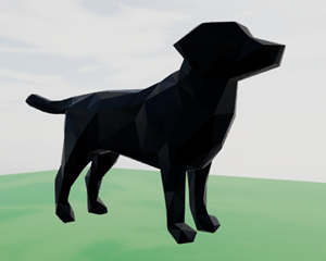
New Primitive - Ruby
The Ruby Primitive quickly and easily adds geometry with irregular surfaces that can be used to test out:
- appearances
- textures
- lighting
- animations
It can also act as a reference model to add a sense of scale to your DriveWorks 3D scene.
New Functions
Additional functionality to enhance your implementation.
Higher Order Functions
Higher Order Functions allow data (in a table or array) to be transformed or filtered by a DWLambda.
The following higher order functions functions are included in this release:
- TableMap
Applies a Lambda Function across a provided table or array to transform the data into a new array.
For example:
- An existing table could have symbols applied to each value in a column. Use TableMap to remove the symbol so the value can be used in an equation.
- An existing table column could have values that require converting to a different unit.
- TableFilterByFunction
Filters a table or array based on a single column using the provided Lambda Function.
For example:
- An existing table may require rows filtering based on a match in the given column but still exclude certain rows.
- TableFilterByRowFunction
Filters a table or array using the provided Lambda Function applied to each row.
For example:
- An existing table may require filtering based on a comparison of values in two cells of each row.
TableRemoveColumn
Returns a new array with the given column removed.
TableRemoveColumn
PolygonCreateArc

Use with the Fill and Hole Path parameters of the 3D Extrusion entity to create a new arc polygon.
See PolygonCreateArc for more information.
PolygonCreateUniformThickLine

Use with the Fill and Hole Path parameters of the 3D Extrusion entity to create a new uniform thick line polygon.
See PolygonCreateUniformThickLine for more information.
Additional styling to give form controls a completely modern look.
Picture Size Mode
The Picture Size Mode property can have the value Cover applied.
Cover allows an image to cover the available limits of the controls while maintaining its aspect ratio and without displaying any whitespace.
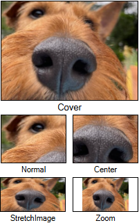
The Picture Size Mode property is available on the following controls when a Picture is applied:
TinyMCE Control
The following properties can now be controlled for the TinyMCE Control:
- Allow Printing - allows the Print tool to be enabled or disabled on the control.
- Border Radius - specifies the border radius of the control.
Label Control
Drive the border style of a Label control with a rule.
The Border Style property, on a Label control, can now be made dynamic.
Button Controls
The following properties have been added to the Clipboard Button, Dialog Button, Macro Button and Upload Control.
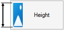
- Picture Height
Specifies the height of the picture container inside the button.
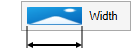
- Picture Width
Specifies the width of the picture container inside the button.
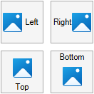
- Picture Position
Specifies the position of the picture container inside the button, relative to the text. Applies when Picture Style is set to TextAndPicture.
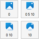
- Picture Border Radius
Specifies the border radius of the picture container inside the button. Also available for Hover and Pressed events.
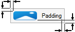
- Button Padding
Specifies the padding around the picture and/or text on the button control.
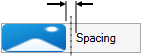
- Button Spacing
Specifies the spacing between the button's text and picture.
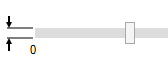
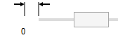
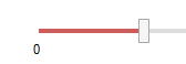
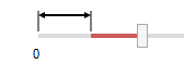
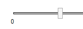
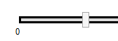
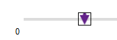
Slider Control - Track
The following properties can now be controlled for the track of the Slider control:
Slider Control - Thumb
The following properties can now be controlled for the thumb of the Slider control:
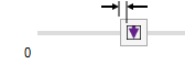
- Thumb Height
Specifies the height of the Slider's Thumb.
- Thumb Width
Specifies the width of the Slider's Thumb.
- Thumb Image Size Mode
Controls how the image is sized within the Slider's Thumb.
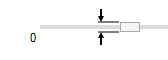
- Thumb Padding
Specifies the padding of the Slider's Thumb when a picture is used for the Thumb Image.
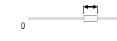
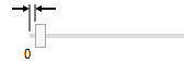
- Thumb Margin
Specifies the margin of the Thumb from the edge of the Control. This can be used to make the Thumb appear inside of the Track.
Usability & UI
Focused visual updates and enhancements add further functionality across DriveWorks.
Word Document
Bookmarks placed in the header or footer of .docx (Microsoft Word Documents) can be driven.
Previously only .doc file types were supported.
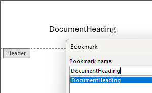
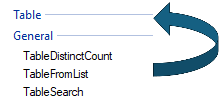
How To Create A Bookmark In WordAll Table Functions are in the Table Category
TableDistinctCount, TableFromList and TableSearch functions were previously listed in the General category (in the Functions list).
These have been moved to the Table category.
Go to the Function ListRules Builder Settings
The color of the Caret (the blinking vertical line that indicates the cursor position within the rule editor window) can be changed from the Rules Builder Settings.
 Change the Caret Color
SOLIDWORKS PDM Professional
New and enhanced functions and tasks to integrate with PDM.
New Function
PDMGetFolderTemplates
Returns a list of Folder Templates in the current vault accessible by the PDM user.
Enhanced Functions
PDMBasicSearch
- Refresh parameter added to allow re-calculation during the running of a Specification.
PDMFileSearch
- Folder parameter added to allow the search to run from the specified folder and not the entire vault.
- Refresh parameter added to allow re-calculation during the running of a Specification.
New Specification Tasks
Enhanced Specification Tasks
PDMPro: Update File Data Card
- Configuration or Sheet Name Property added to allow the update to be applied to a Configuration or Sheet specific data card, rather than a file data card.
- Check in Comment Property added will drive the given value into the comment on the data card when checking the file in.
PDMPro: Create Folder
- Template Name Property added to select a PDM Folder Template to be applied to the new folder.
New Generation Tasks
Common PDM tasks can now run on Assemblies, Parts or Drawings as Generation Tasks.
CPQ & Dashboard DriveApps
Enhancing out-of-the-box functionality and speeding up implementation time for CPQ and Dashboard DriveApps.
Interactive Breadcrumbs
Breadcrumbs displayed in the header bar are interactive.
Quickly navigate to any previous page from any sub-menu.
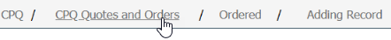
On devices with smaller resolutions, where the available space cannot display the entire breadcrumb trail, click the ellipses to display a dialog with the breadcrumbs that have been removed due to the overflow.
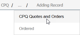
Interactive breadcrumbs are instantly available (no additional setup required after upgrading) for the Dashboard and CPQ DriveApps.
Run Macro on a List
A macro can be run when a dashboard tile is selected that has been configured to display a list.
This applies to a Custom List (created using the List Data Provider project template) and applied to a tile.
This allows the list data to dynamically change by:
- Pre-applying a filter to the list based on a rule.
- Applying a user-specific ordering to the data in the list based on a rule.
- And optionally apply a macro argument to allow the same macro to be used, but with differing outcomes depending on where it is run from.
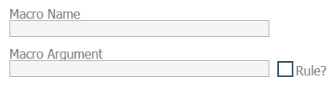
This feature is available for lists created in the CPQ or Dashboard DriveApps.
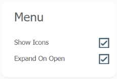
Show Icons on Collapsed Menu
Dashboards displayed as a menu allow Icons to remain in view when the menu is in a collapsed state, but hidden when in an expanded state.
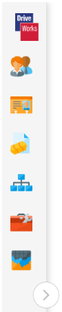
Apply this setting from the Appearance > Menu item in the DriveApp Settings
Dashboard Tiles - Appearance Settings
Control the size and colors used on tiles in the appearance settings.
New and improved settings added to the tile designer are:
- Ratio
Control the aspect ratio of the tiles by selecting from:
The Tile Layout Preview displays the tile in the selected Ratio.
- Size
Choose the size of a tile by selecting from:
The height and width of each selection depends on the chosen Ratio.
The height and width is displayed, in pixels, on the Tile Layout Preview.
- Hover Border Color
Choose a hexadecimal color value to apply to the tiles border when it is hovered over.
- Left Border
Toggle to display a bar on the left hand border of a tile.
- Left Border Color
Choose a hexadecimal color value to apply to the left border.
Apply these settings from the Appearance > Dashboard Tiles item in the DriveApp Settings
Tile Layout Preview - Appearance Settings
Control the position of text and icons used on tiles in the appearance settings.
New settings added for the Tile Layout Preview are:
- Title
Toggle to choose if the tile title is to be displayed.
The title placeholder will be shown or hidden on the Tile Layout Preview.
- Description
Toggle to choose if the tile description is to be displayed.
The description placeholder will be shown or hidden on the Tile Layout Preview.
- Icon
Toggle to choose if the tile icon is to be displayed.
The icon placeholder will be shown or hidden on the Tile Layout Preview.
- Tile Layout Preview
The Preview of the tile layout shows the actual size and aspect ratio selected for the tile.
The position of each text block and icon can be controlled using the Move Up and Move Down arrows to the left hand side of the preview.
The vertical alignment of the text within the title and description placeholders can be adjusted by:
- Select the placeholder required to have its vertical justification changed in the preview window.
- Select the required justification arrow on the left hand side of the preview.
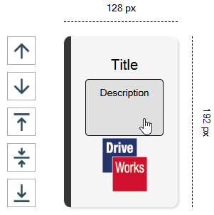
Apply these settings from the Appearance > Dashboard Tiles item in the DriveApp Settings
CPQ DriveApp
Enhancing out-of-the-box functionality and speeding up implementation time for the DriveWorks CPQ DriveApp.
Instantly Open Copied Quotes
Copying a quote will instantly open the item for editing.
Previously a copied quote required selecting from the Orders list before it could be opened for editing.
The quote will not be created if cancelled immediately after copying.
Open Copied Quotes is instantly available (no additional setup required after upgrading) for the CPQ DriveApp.
Update Pricing on Copy Order
Decide how pricing updates are applied when an Order is copied.
Orders copied from old items will include the original pricing, choose how pricing updates are applied in the CPQ settings.
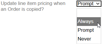
See Copy Order Settings for more information.
Copy Order State Reset
Copying an order will automatically reset the workflow state.
Previously a quote would be in the same state it was copied from, requiring a transition to be triggered to reset the workflow.
See Workflow Settings for more information.
Improved Linked Item Edit Experience
The CPQ Custom Item form template has been enhanced to allow linked custom items to be opened for editing inside its parent, once it has been added to a quote.
The topic How To: Upgrade Linked Items details how this can be implemented for existing custom items.
Confirmation Dialog when Clicking Interactive Breadcrumb
The CPQ Custom Item form template has been enhanced to display a confirmation dialog when an interactive breadcrumb is clicked.
The dialog will only show if the custom item being edited has any unsaved changes.
The topic How To: Add a breadcrumb confirmation dialog to a Custom Item details how this can be implemented for existing custom items.
Additional Quote/Order Permissions
Permissions on which Teams can see the different elements of how an item is priced can now be set.
Select permissions for the following elements:
- Discounts
- Quote Pricing
- Freight
- Tax
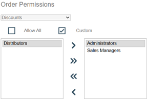
See Order Permissions for more information.