Date Picker
Introduction
The Date Picker is a form control that allows a date to be selected from an interactive calendar.
The Date Picker appears on a user form as in the image below:

When the user hovers over the control the icon will appear as in the image below:

Once the Date Picker is selected the calendar will pop out from the control, as in the image below:
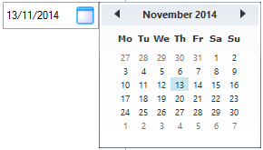
Once a date is selected from the calendar this will be the value of the control.
Minimum and maximum values can be set on the control to prevent dates outside of those ranges from being selected.
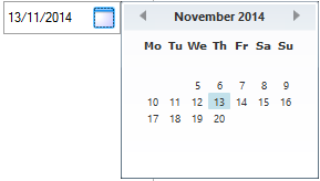
Control properties other than the return value (which returns the selected date) can be retrieved from the control:
- DatePicker1ListData - Will return the formatted string of the selected date.
- DatePicker1Default - Will return the format string that has been applied to the selected date.
Appearance Properties
Background ColorThe Background Color property sets the background color for the control.
Property Type:  Static
Default Value: Takes the color of the user form the control is added to.
By default the background color for all controls are set to the same value as the background color for the user form they exist on.
The background area of a control covers the width and height of
a control and covers the caption (or text) area. The color of the
actual control (drop down, text box, slider, button etc.) portion
cannot be set.
The background property requires a system color name to be set or a hexadecimal color value.
To Change the Default Value
Ensure the property is a static property (the gray orb  will be displayed alongside the property name)
The default value of the static property can be changed by one of the following methods:
- Using the Color Chooser.
- Click in the property for the control to be changed
- Click the drop down list at the end of the property value field
- Select the color tab to use (from Custom, Web or System)
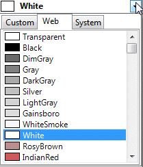
- Select the required color from the list.
- Typing the Color name or Hexadecimal value.
- Click in the property for the control to be changed
- Type the name of the color or it's hexadecimal value directly into the property field.
Examples
| Background Color Property Value (static) | Result | Notes |
|---|
| White | Changes the background color of the control to white | The value can be selected by clicking the drop down that
accompanies the property. |
| Transparent | Changes the background color of the control to be
transparent | The value can be selected by clicking the drop down that
accompanies the property. |
| #644B47 | Changes the background color of the control to be the color of
the hexadecimal value #644B47 | The value can be set by entering the value directly into the
property. |
A rule can also be built for this property by changing the type to dynamic.
See How To: Change A Static Property To A Dynamic Property.
| Background Color Property Value (dynamic) | Result | Notes |
|---|
| COLORHEX(56,129,205,255) | Changes the background color of the control to be the
hexadecimal equivalent of the RGB and Opacity values 56, 129, 205,
255. | The value can be set by making the property dynamic (see
above), launching the rule builder and applying the function. |
| ColorHex(RedReturn, GreenReturn, BlueReturn,
OpacityReturn) | Changes the background color of the control to be the
hexadecimal equivalent of the RGB and Opacity values coming from
the corresponding controls. | The value can be set by making the property dynamic (see
above), launching the rule builder and applying the function. |
Value set in Form Designer. Static
properties can be made Dynamic by double clicking the gray radio
button.
The caption or text property is the text to display, on the user
form, alongside or on the control.
Property Type:  Static
Default Value: Takes the name given to the control when it was added
To Change the Default Value
Ensure the property is a static property (It will display the gray orb
 alongside the property name)
The default value of the static Caption property can be
changed by typing the required caption directly into the caption
property field
- Click in the Caption property for the control to be
changed
- Type the required caption directly into the property field
Changing the
Caption will NOT change the name of the control
When
changing the caption, spaces in between words are permitted.
Capitalizing each word without using spaces will not have the same
affect as when the control is first created.
Examples
| Caption Property Value (static) | Result | Notes |
|---|
| Please Enter The Length | Displays the caption
Please Enter The Length alongside the control. | |
A rule can also be built for this property by changing the type to dynamic.
See How To: Change A Static Property To A Dynamic Property.
| Caption Property Value (Dynamic) | Result | Notes |
|---|
| IF(LengthReturn<25, "Please Enter A Length Over
25", "Please Enter The Length") | Displays the caption
Please Enter A Length Over 25, when the control
Length is less than 25. Displays the caption
Please Enter The Length when the control Length is
not less than 25. | |
Value set in Form Designer. Static
properties can be made Dynamic by double clicking the gray radio
button.
This description applies to the following properties:
- Caption Color - sets the color for the text displayed as the caption for the control.
- List Item Color - sets the color for the text displayed as items in the list control.
- Option Item Color - sets the color for the text displayed as items in the list control.
- Text Color - sets the color for text that can be typed into a control.
- Hover Color - sets the color for the caption when hovered over on the hyperlink control.
- Header Color - sets the color for the header on controls that present tabular data.
Property Type:  Static
Default Value: ControlText
By default the caption color and list item color for all controls are set to the the value ControlText.
The property requires a system color name to be set or a
hexadecimal color value.
To Change the Default Value
Ensure the property is a static property (It will display the
gray orb
 alongside the
property name)
The default value of the static property can be changed by
one of the following methods:
- Using the Color Chooser
- Click in the property for the control to be changed
- Click the drop down list at the end of the property value field

- Select the color tab to use (from Custom, Web or System)
- Select the required color from the list
- Typing the Color name or Hexadecimal value
- Click in the property for the control to be changed
- Type the name of the color or it's hexadecimal value directly
into the property field.
Examples
| Color Property Value (static) | Result | Notes |
|---|
| ControlText | Changes the caption or list item color of the control to
ControlText | The value can be selected by clicking the drop down that
accompanies the control. |
| #644B47 | Changes the caption or list item color of the control to
be the color of the hexadecimal value #644B47 | The value can be set by entering the value directly into the
property. |
A rule can also be built for this property by changing the type to dynamic.
See How To: Change A Static Property To A Dynamic Property.
| Color Property Value (dynamic) | Result | Notes |
|---|
| COLORHEX(56,129,205,255) | Changes the caption or list item color of the
control to be the hexadecimal equivalent of the RGB and Opacity
values 56, 129, 205, 255. | The value can be set by making the property dynamic, launching
the rule builder and applying the function. |
| ColorHex(RedReturn, GreenReturn, BlueReturn,
OpacityReturn) | Changes the caption or list item color of the
control to be the hexadecimal equivalent of the RGB and Opacity
values coming from the corresponding controls. | The value can be set by making the property dynamic, launching
the rule builder and applying the function. |
Value set in Form Designer. Static
properties can be made Dynamic by double clicking the gray radio
button.
This description applies to the following properties:
- Font - sets the font for text that can be typed into a control.
- Caption Font - sets the font for the text displayed as the caption for the control.
- List Item Font - sets the font for the text displayed as items in the list control.
- Option Item Font - sets the font for the text displayed as items in the Option Group control.
- Header Font - sets the font for the header on controls that present tabular data.
- Selected Row Font - sets the font for the selected row in the Data Table control.
Property Type:
 Static
Default Value: Microsoft Sans Serif; Regular; 8.25pt
By default the caption font is set to Microsoft Sans Serif;
Regular; 8.25pt.
To Change the Default Value
Ensure the property is a static property (It will display the
gray orb
 alongside the property name)
The default value of the static property can be changed by one of the following methods:
- Using the Font Chooser.
- Click in the property for the control to be changed.
- Click the button at the end of the property value field.

- Select the Font, Font Style, Size and any Effects or Scripts from the Font dialog.
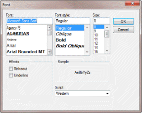
- Click OK.
- Typing the Font values.
- Click in the property for the control to be changed.
- Type the font string value directly into the property field.
Examples
| Font Property Value (static) | Result | Notes |
|---|
| font-family: verdana; font-size: 14.25pt; font-weight: bold;
text-decoration: | Changes the font to verdana, 14,25pt, bold. | |
A rule can also be built for this property by changing the type to dynamic.
See How To: Change A Static Property To A Dynamic Property.
| Font Property Value (dynamic) | Result | Notes |
|---|
| IF( LengthReturn<100 , "font-family: verdana;
font-size: 14.25pt; font-weight: bold; font-style: italic;
text-decoration:", "font-family: verdana; font-size: 12pt;
text-decoration:" | Changes the font to verdana, 14,25pt, bold italic when Length is
less than 100. Otherwise it will be set to Verdana, 12pt regular | |
Value set in Form Designer. Static
properties can be made Dynamic by double clicking the gray radio
button.
This description applies to the following properties:
- Font - sets the font for text that can be typed into a control.
- Caption Font - sets the font for the text displayed as the caption for the control.
- List Item Font - sets the font for the text displayed as items in the list control.
- Option Item Font - sets the font for the text displayed as items in the Option Group control.
- Header Font - sets the font for the header on controls that present tabular data.
- Selected Row Font - sets the font for the selected row in the Data Table control.
Property Type:
 Static
Default Value: Microsoft Sans Serif; Regular; 8.25pt
By default the caption font is set to Microsoft Sans Serif;
Regular; 8.25pt.
To Change the Default Value
Ensure the property is a static property (It will display the
gray orb
 alongside the property name)
The default value of the static property can be changed by one of the following methods:
- Using the Font Chooser.
- Click in the property for the control to be changed.
- Click the button at the end of the property value field.

- Select the Font, Font Style, Size and any Effects or Scripts from the Font dialog.

- Click OK.
- Typing the Font values.
- Click in the property for the control to be changed.
- Type the font string value directly into the property field.
Examples
| Font Property Value (static) | Result | Notes |
|---|
| font-family: verdana; font-size: 14.25pt; font-weight: bold;
text-decoration: | Changes the font to verdana, 14,25pt, bold. | |
A rule can also be built for this property by changing the type to dynamic.
See How To: Change A Static Property To A Dynamic Property.
| Font Property Value (dynamic) | Result | Notes |
|---|
| IF( LengthReturn<100 , "font-family: verdana;
font-size: 14.25pt; font-weight: bold; font-style: italic;
text-decoration:", "font-family: verdana; font-size: 12pt;
text-decoration:" | Changes the font to verdana, 14,25pt, bold italic when Length is
less than 100. Otherwise it will be set to Verdana, 12pt regular | |
Value set in Form Designer. Static
properties can be made Dynamic by double clicking the gray radio
button.
This description applies to the following properties:
- Caption Color - sets the color for the text displayed as the caption for the control.
- List Item Color - sets the color for the text displayed as items in the list control.
- Option Item Color - sets the color for the text displayed as items in the list control.
- Text Color - sets the color for text that can be typed into a control.
- Hover Color - sets the color for the caption when hovered over on the hyperlink control.
- Header Color - sets the color for the header on controls that present tabular data.
Property Type:  Static
Default Value: ControlText
By default the caption color and list item color for all controls are set to the the value ControlText.
The property requires a system color name to be set or a
hexadecimal color value.
To Change the Default Value
Ensure the property is a static property (It will display the
gray orb
 alongside the
property name)
The default value of the static property can be changed by
one of the following methods:
- Using the Color Chooser
- Click in the property for the control to be changed
- Click the drop down list at the end of the property value field

- Select the color tab to use (from Custom, Web or System)
- Select the required color from the list
- Typing the Color name or Hexadecimal value
- Click in the property for the control to be changed
- Type the name of the color or it's hexadecimal value directly
into the property field.
Examples
| Color Property Value (static) | Result | Notes |
|---|
| ControlText | Changes the caption or list item color of the control to
ControlText | The value can be selected by clicking the drop down that
accompanies the control. |
| #644B47 | Changes the caption or list item color of the control to
be the color of the hexadecimal value #644B47 | The value can be set by entering the value directly into the
property. |
A rule can also be built for this property by changing the type to dynamic.
See How To: Change A Static Property To A Dynamic Property.
| Color Property Value (dynamic) | Result | Notes |
|---|
| COLORHEX(56,129,205,255) | Changes the caption or list item color of the
control to be the hexadecimal equivalent of the RGB and Opacity
values 56, 129, 205, 255. | The value can be set by making the property dynamic, launching
the rule builder and applying the function. |
| ColorHex(RedReturn, GreenReturn, BlueReturn,
OpacityReturn) | Changes the caption or list item color of the
control to be the hexadecimal equivalent of the RGB and Opacity
values coming from the corresponding controls. | The value can be set by making the property dynamic, launching
the rule builder and applying the function. |
Value set in Form Designer. Static
properties can be made Dynamic by double clicking the gray radio
button.
Behavior Properties
DateThis property displays the current Return Value of the control.
This property determines how the date value for the control should be formatted. If left empty, by default this will format the date using the current culture's format.
Examples
| Date Format Property | Result | Notes |
|---|
| "dd/mm/yy" | Will format the date as 13/11/14 | |
| "mmmm-dd-yyyy" | Will format the date as
November-13-2014 | |
The Default Value property will set a value to the control when the property type is made Dynamic and a rule is applied.
Property Type:
 Static
Default Value: False (Check Box)
Default Value: null (Combo Box, List Box, Text Box, Option Group)
Default Value: 0 (Numeric Text Box, Slider, Spin Button)
The Default Value property forces the result of the applied rule
into the controls return value, however the control remains
available for further interaction by the user.
A rule can be built for this property by changing the type to dynamic.
See How To: Change A Static Property To A Dynamic Property.
The Dynamic Rule for this property is required to
have:
- A valid value for the control type when the Default Value is
applied
- The Name (
not return value) of the control the Default Value
is being applied to, when a Default Value is not required.
The chart below lists the required values for the controls this
property is available for:
| Control Type | Valid Values |
|---|
| Check Box | A Boolean value (True, False) |
| Combo Box, List Box, Text Box, Option Group | An item that is selectable from the control (see caution
below) |
| Numeric Text Box, Slider, Spin Button | A Numeric value |
Use of the Default Value on a List Type Control (Combo
Box, List Box, Option Group)
The value being returned by the Default Value rule must be
available from the listed items, available for selection, in order
for it to be displayed in the control.
If the
control is required to have a value set that cannot be changed
consider the
...(Override Rule) property.
Examples
This example sets the Default Value of a
Check Box that has the Name
MyCheckBox
| Property Value | Result | Notes |
|---|
| IF(
LengthReturn>100, TRUE,
MyCheckBox) | When the value being returned from the control
Length is greater than 100 MyCheckBox will be
checked (TRUE), otherwise the control will allow user interaction
as denoted by the result
MyCheckBox. The control can still be unchecked while the Default Value
property rule results in a value to pass into the control. The Default Value will be re-applied only when the rule argument
changes, forcing a re-calculation i.e. when the Length control has
a value greater than 100 re-entered. | The Name (not Return value) of the control the rule is applied
to is required when the Default Value is not to be
enforced, i.e.
MyCheckBoxNOT MyCheckBox
Return. |
This example sets the Default Value of a
Combo Box, List Box, Text Box or Option Group
that has the Name
GlassType
| Property Value | Result | Notes |
|---|
| IF(
FireRatingReturn<>0,
"Fire Rated Glass",
GlassType) | When the value being returned from the control
FireRating does not equal 0 (zero) the control
GlassType will result in
"Fire Rated Glass", otherwise the control will
allow user interaction as denoted by the result
GlassType. The control can still be selected while the Default Value
property rule results in a value to pass into the control. The Default Value will be re-applied only when the rule argument
changes, forcing a re-calculation i.e. when the FireRating control
has a value that does not equal 0 re-entered. | The Name (not Return value) of the control the rule is applied
to is required when the Default Value is not to be enforced, i.e.
GlassTypeNOT GlassType
Return. The value "Fire Rated Glass" must be available from the listed
items, available for selection, in order for it to be displayed in
the control once the Default Value is enforced. |
This example overrides the value of a
Numeric Text Box, Slider or Spin Button that has
the Name
MyNumericControl
| Property Value | Result | Notes |
|---|
| IF(
LengthReturn>100, 2,
MyNumericControl) | When the value being returned from the control
Length is greater than 100 MyNumericControl will
be set to 2, otherwise the control will allow user interaction as
denoted by the result
MyNumericControl. The control can still be selected while the Default Value
property rule results in a value to pass into the control. The Default Value will be re-applied only when the rule argument
changes, forcing a re-calculation i.e. when the Length control has
a value greater than 100 re-entered. | The Name (not Return value) of the control the rule is applied
to is required when the Default Value is not to be enforced, i.e.
MyNumericControlNOT MyNumericControl
Return. |
Value set in Form Designer. Static
properties can be made Dynamic by double clicking the gray radio
button.
The enabled property determines if the control is available for
user interaction or not.
Property Type:  Dynamic
Default Value: True
When the property is set to TRUE, user interaction is allowed.
When the property is set to FALSE, user interaction is not allowed.
In most cases the control whose enabled property is set to
FALSE, takes on a disabled appearance to make it obvious to the
user that the control is disabled.
To Change the Default Value
The default value of the property can be changed by any of the following methods:
- Enter the required value directly into the enabled property field.
- Click in the property for the control to be changed.
- Type the required value directly into the property field.
- Activate the rule builder.
- Click in the property for the control to be changed.
- Click the build button at the end of the property field to launch the rule builder
 .
. - Enter the rule in the rule editor and click OK to apply.
Examples
| Enabled Property Value | Result | Notes |
|---|
| True | Enables the control | The value can be added without launching the rule builder. Type
the value directly into the control property. |
| False | Disables the control | The value can be added without launching the rule builder. Type
the value directly into the control property. |
| IF(OtherControlReturn="Red" , True , False) | Enables the control when OtherControl equals Red, otherwise the
control is disabled. | Launch the rule builder by selecting the property and clicking
the build button to apply the rule. |
| IF(OtherControlValue>200 , True , False) | Enables the control when OtherControl is greater than 200,
otherwise the control is disabled. | Launch the rule builder by selecting the property and clicking
the build button to apply the rule. |
Value can be controlled by a rule.
The error result property determines whether the value of the control is in error.
Property Type:  Dynamic
Default Value: null
The result of this property can be:
- A text string of the message to display.
- A number representing a corresponding number from the Form Messages stage.
To Change the Default Value
The default value of the property can be changed by any of the following methods:
- Enter the required value directly into the error result property field.
- Click in the property for the control to be changed.
- Type the required value directly into the property field.
- Activate the rule builder.
- Click in the property for the control to be changed.
- Click the build button at the end of the property field to launch the rule builder
 .
. - Enter the rule in the rule editor and click OK to apply.
Ensure this property is either a null (blank) OR can result in a 0 (zero) value.
Failure to do this will result in the control always being in error and will not allow a specification to be completed.
Examples
| Error Result Property Value | Result | Notes |
|---|
| The control will never be in error | |
| IF(LengthReturn="", "Please enter a value", 0) | The message Please enter a value will be displayed in the task
list during specification when the control Length is less than
1000 | Use the rule builder to apply the rule |
| IF(LengthReturn<1000 , 2, 0) | The message as calculated by the Form Message 1 will be
displayed in the task list during specification when the control
Length is less than 1000 | Use the rule builder to apply the rule |
Value can be controlled by a rule.
Form Messages are accessed from DriveWorks Administrator.
These allow common messages to be allocated an incremental
number that can be referenced in the Error Result property of form
controls.
The Error Result property determines if the message is to be
displayed during specification.
Form messages are displayed in the task list.
A custom message that can be displayed as specification
tasks during specification.
Dynamic
Provides a placeholder to store a maximum value for the control.
Use in conjunction with the Error Result property to inform the user an invalid entry has been made.
Dynamic
Provides a placeholder to store a minimum value for the control.
Use in conjunction with the Error Result property to inform the user an invalid entry has been made.
The Tab Index property determines the order in which the control gains focus when the Tab key is pressed by the user during specification.
Property Type: Fixed
Default Value: 0
To Change the Default Value
The default value of the property can be changed by typing the required value directly into the property field
- Click in the property for the control to be changed
- Type the required value directly into the property field
- Hit return to apply
Examples
| Tab Index Property Value | Result | Notes |
|---|
| 1 | Is the first control in the tab order | |
Form Design
A type of control property where the value can only be set in
the Form Designer (not by a rule).
The Visible property determines if the control is visible to the user during specification.
Property Type:  Dynamic
Default Value: True
When the property is set to TRUE, the control is visible.
When the property is set to FALSE, the control is not visible.
Visible Behavior when Value is False
Form Designer - The control will be shown
Form Design Test - The control will not be shown
Specification Test Mode - The control will be shown
To Change the Default Value
The default value of the property can be changed by typing the required value directly into the caption property field
- Click in the property for the control to be changed
- Type the required value directly into the property field
- Click in the property for the control to be changed
- Click the build button at the end of the property field to
launch the rule builder

- Enter the rule in the rule editor and click OK to apply
Examples
| Visible Property Value | Result | Notes |
|---|
| IF(NumberOfSections>=3 , TRUE, FALSE) | When the control NumberOfSections is greater than or equal to 3
the control will be visible (TRUE), otherwise it will not be
visible (FALSE) | Launch the rule builder by selecting the property and clicking
the build button to apply the rule. |
| MyCheckBoxReturn | As the Check Box, MyCheckBox, returns a TRUE or FALSE value the
visible property will be controlled by the value coming from the
check box. | Launch the rule builder by selecting the property and clicking
the build button to apply the rule. |
Value can be controlled by a rule.
General Properties
(Name)The (Name) property determines the actual name of a control.
Property Type: Fixed
Default Value: The name entered for the control when it was created
To Change the Default Value
The default value of the property can be changed by typing the
required value directly into the caption property field
- Click in the property for the control to be changed
- Type the required value directly into the property field
- Hit return to apply
Changing the Name of a control will launch the renaming
parser.
This searches the entire project and updates any areas that make
use of the existing control name with the new name.
Examples
| (Name) Property Value | Result | Notes |
|---|
| NewControlName | Renames the control to NewControlName | |
Form Design
A type of control property where the value can only be set in
the Form Designer (not by a rule).
The (Tag) property allows comments to be applied to the
control.
Property Type: Fixed
Default Value: null
This property is not available for use in a rule.
Form Design
A type of control property where the value can only be set in
the Form Designer (not by a rule).
The Tooltip Duration property sets the duration, in seconds, that the tooltip is to remain visible.
Property Type: Fixed
Default Value: 5
Examples
| Tooltip Duration Property Value | Result | Notes |
|---|
| 5 | The tooltip will be displayed for 5 seconds, or until the mouse pointer leaves the control area. | |
Form Design
A type of control property where the value can only be set in
the Form Designer (not by a rule).
The Tooltip Text property specifies the text to display as a tooltip when hovering over a control.
Property Type:  Static
Default Value: No default value is applied to this property

The text in the message can be formatted to alter the appearance of the text.

See How To: Correctly Format Text for more information.
To Change the Default Value
Ensure the property is a static property (It will display the gray orb alongside the property name).
The default value of the static property can be changed by:
- Click in the property for the control to be changed
- Type the required value.

Examples
| Tooltip Text Property Value (static) | Result | Notes |
|---|
| (min 1500 max 3500) |  | |
A rule can also be built for this property by changing the type to dynamic.
See How To: Change A Static Property To A Dynamic Property.
| Tooltip Text Property Value (dynamic) | Result | Notes |
|---|
| "Please enter a [i]height[/i] between [b][color red]" & HeightMin & "[/b][/color] and [b][color red]" & HeightMax & "[/b][/color]" |  | This example shows various text formatting techniques and also the use of |
Value set in Form Designer. Static
properties can be made Dynamic by double clicking the gray radio
button.
Layout Properties
Caption WidthCaption Width
The Caption Width property sets the width of the area that
displays the caption on the control.
Property Type:
 Static
Default Value: varies from
100 depending on the control type
About
To Change
the Default Static ValueEnsure the property is a static property (It will display the
gray orb
 alongside the
property name)
The default value of the static property can be changed by
typing the required height directly into the property
- Click in the property for the control to be changed
- Type the required width value.
The static property for this control can be controlled by a
rule. To do this the property must be made dynamic:
To change a static property to a dynamic property:
- Locate the static property from the list of available
properties.
- Double click the gray radio button
 to the right
of the property name.
 - The button will turn green
 indicating
the property is now dynamic.
To return the changed dynamic property to a static property:
- Locate the static property in the property grid.
- Double click the green radio button
 to the
right of the property name.
 - The button will turn grey
 indicating
the property is now static.
When returning a changed dynamic property to a static property
any rule applied while it was dynamic will be lost.
The default static property value will be the value the rule
equated to before it was changed.
Ensure the property is a dynamic property (It will display the
green orb
 alongside the
property name)
- Click in the property for the control to be changed
- Click the build button at the end of the property field to
launch the rule builder

- Enter the rule in the rule editor and click OK to apply
Properties that are common between controls will be displayed in
the properties list when controls are multi-selected.
Multi-selecting controls to apply the same property value is
supported.
Examples
| Vaption Width Property Value (static) | Result | Notes |
|---|
| 200 | Changes the caption width of the control to 200 units | The value is entered directly into the property. |
| Caption Property Value (dynamic) | Result | Notes |
|---|
| IF(DWVariableNumberOfOptions=3, 60, 25) | Sets the caption width to be 60 if the variable is 3, otherwise
the caption widthis 25 | The value can be set by making the property dynamic (see
above), launching the rule builder and applying the function. |
| DWVariableNumberOfOptions*24 | Multiplies the variable by 24 | The value can be set by making the property dynamic (see
above), launching the rule builder and applying the function. |
Value set in Form Designer. Static
properties can be made Dynamic by double clicking the gray radio
button.
Height
The Height property sets the height of the control.
Property Type:  Static
Default Value: varies from 24 onwards depending on the control type.
To Change the Default Value
Ensure the property is a static property (It will display the gray orb alongside the property name).
The default value of the static property can be changed by:
- Click in the property for the control to be changed
- Type the required value.
Examples
| Height Property Value (static) | Result | Notes |
|---|
| 55 | Changes the height of the control to 55 units | The value is entered directly into the property. |
A rule can also be built for this property by changing the type to dynamic.
See How To: Change A Static Property To A Dynamic Property.
| Height Property Value (dynamic) | Result | Notes |
|---|
| IF(DWVariableNumberOfOptions=3, 60, 25) | Sets the height to be 60 if the variable is 3, otherwise the
height is 25 | The value can be set by making the property dynamic (see
above), launching the rule builder and applying the function. |
| DWVariableNumberOfOptions*24 | Multiplies the variable by 24 | The value can be set by making the property dynamic (see
above), launching the rule builder and applying the function. |
Value set in Form Designer. Static
properties can be made Dynamic by double clicking the gray radio
button.
The Left property sets the position of the control from the left
of the user form.
Property Type:
 Static
Default Value: varies from 50 depending on the quantity of controls that have been created consecutively.
To Change the Default Value
Ensure the property is a static property (It will display the gray orb alongside the property name).
The default value of the static property can be changed by:
- Click in the property for the control to be changed
- Type the required value.
Examples
| Left Property Value (static) | Result | Notes |
|---|
| 55 | Changes the left of the control to 55 units | The value is entered directly into the property. |
A rule can also be built for this property by changing the type to dynamic.
See How To: Change A Static Property To A Dynamic Property.
| Height Property Value (dynamic) | Result | Notes |
|---|
| IF(DWVariableNumberOfOptions=3, 60, 25) | Sets the left to be 60 if the variable is 3, otherwise the
height is 25 | The value can be set by making the property dynamic (see
above), launching the rule builder and applying the function. |
| DWVariableNumberOfOptions*24 | Multiplies the variable by 24 | The value can be set by making the property dynamic (see
above), launching the rule builder and applying the function. |
Value set in Form Designer. Static
properties can be made Dynamic by double clicking the gray radio
button.
The Top property sets the position of the control from the top
of the user form.
Property Type:
 Static
Default Value: varies from
50 depending on the quantity of controls that have
been created consecutively.
To Change the Default Value
Ensure the property is a static property (It will display the gray orb alongside the property name).
The default value of the static property can be changed by:
- Click in the property for the control to be changed
- Type the required value.
Examples
| Top Property Value (static) | Result | Notes |
|---|
| 55 | Changes the top of the control to 55 units | The value is entered directly into the property. |
A rule can also be built for this property by changing the type to dynamic.
See How To: Change A Static Property To A Dynamic Property.
| Height Property Value (dynamic) | Result | Notes |
|---|
| IF(DWVariableNumberOfOptions=3, 60, 25) | Sets the top to be 60 if the variable is 3, otherwise the
height is 25 | The value can be set by making the property dynamic (see
above), launching the rule builder and applying the function. |
| DWVariableNumberOfOptions*24 | Multiplies the variable by 24 | The value can be set by making the property dynamic (see
above), launching the rule builder and applying the function. |
Value set in Form Designer. Static
properties can be made Dynamic by double clicking the gray radio
button.
The Width property sets the width of the control.
Property Type:
 Static
Default Value: varies from 100 onwards depending on the control type.
To Change the Default Value
Ensure the property is a static property (It will display the gray orb alongside the property name).
The default value of the static property can be changed by:
- Click in the property for the control to be changed
- Type the required value.
Examples
| Width Property Value (static) | Result | Notes |
|---|
| 200 | Changes the width of the control to 200 units | The value is entered directly into the property. |
A rule can also be built for this property by changing the type to dynamic.
See How To: Change A Static Property To A Dynamic Property.
| Width Property Value (dynamic) | Result | Notes |
|---|
| IF(DWVariableNumberOfOptions=3, 60, 25) | Sets the width to be 60 if the variable is 3, otherwise the
width is 25 | The value can be set by making the property dynamic (see
above), launching the rule builder and applying the function. |
| DWVariableNumberOfOptions*24 | Multiplies the variable by 24 | The value can be set by making the property dynamic (see
above), launching the rule builder and applying the function. |
Value set in Form Designer. Static
properties can be made Dynamic by double clicking the gray radio
button.
Value can be controlled by a rule.
Value can be controlled by a rule.
 Static
 will be displayed alongside the property name)


 .
.

