Check Box
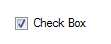
The Check Box control displays an image of a box
 alongside a caption by
default.
alongside a caption by
default.
When the control is selected (or checked) in the running of a
specification or testing the image shows a check mark
 within
the box.
within
the box.
When the form control is created the name given to the control
will display as its caption. This can be changed by selecting the
Caption property.
The caption can be displayed either side of the check box by
changing the Check Alignment property.
This form control is typically used for:
- Making a Yes/No selection or a number of Yes/No selections.
- Invoking Form Navigation Decisions.
- Disabling Form Controls.
- Overriding default values.
Return value
When selected (checked) the form control reports
TRUE.
When unselected (not checked) the form control reports
FALSE.
Any rule that references the check box return value should use these values.
Properties
Appearance
Appearance - Border
Appearance - Caption
Appearance - Picture
Behavior
- Checked
Controls whether the check box is checked.
- Checked (Override Rule)
Controls whether the check box is checked.
- Default Value
Controls the default value of the control. If the default value is based on a rule and the value
changes, then the value of the control will be changed to be the new default value.
- Enabled
Controls whether the control is enabled (if the result is TRUE) or disabled (if the result is
anything other than TRUE, e.g. FALSE).
- Error Result
Determines whether the value of the control is in error. The result of this rule is a string
containing the error message if the value is in error, otherwise a blank string or the number zero.
- Tab Index
Configures the position of the control in the form tab order.
- Visible
Determines whether the control is visible (TRUE) or hidden (FALSE).
Events
General
- (Metadata)
Optional text which can be used to provide information belonging to or about a control. For example,
a list of CSS classes which can be parsed and applied to the control using the Integration Theme in
DriveWorks Live. This doesn't affect the control's behavior.
- (Name)
The name of the control
- (Tag)
Optional text which can be used to describe the control, but which doesn't affect the control's
behavior.
- Tooltip Duration
Controls the duration, in seconds, for which the tooltip will remain visible. Values of 0 and below
indicate an infinite duration.
- Tooltip Text
Specifies the text to display in a tooltip when hovering over the control.
Layout
- Height
Controls the height of the control.
- Left
Controls the left position of the control.
- Top
Controls the top position of the control.
- Width
Controls the width of the control.
A user form control which displays a check mark when selected.
The check box reports TRUE when selected and FALSE when not
selected.