Using The Dashboard DriveApp
The Dashboard DriveApp gives access to useful DriveWorks resources and KPI's taken directly from the Group.
Running
When the Dashboard is running (see DriveApps) the Home screen will be shown (unless the Start Parameter has been customized).
Click on the following Home screen tiles to:
 |  |  | 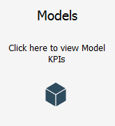 |
| DriveWorks - Opens the DriveWorks corporate website in the default browser. | Community - Opens the DriveWorks Community in the default browser. | DriveWorks Live - Opens the DriveWorks Demo site in the default browser. | Models -
Opens the Model KPI dashboard, to display dashboard tiles with KPI's for: - Generated Models
- Queued models
- Failed Models
- Top Level Models
- Connected Autopilots
|
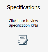 |  |  |
| Specifications -
Opens the Specification KPI dashboard to display dashboard tiles with KPI's for: - Number of Specifications
- Paused Specifications
- Completed Specifications
- Archived Specifications
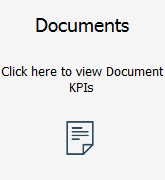
| Documents -
Opens the Document KPI dashboard to display dashboard tiles with KPI's for: - All Documents
- Hidden Documents
- Documents
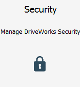
| Security -
Opens the Security dashboard to display dashboard tiles to manage DriveWorks Security: - Teams
Displays the Teams list, allows Teams to be added, edited or deleted. Teams must not contain any Users in order to be deleted. - Users
Displays the Users list, allows Teams to be added or edited. The delete button is currently reserved for a future service pack. Users must be deleted from Security Settings.
|
Settings
The default tiles can be removed or customized in the Dashboard settings.
Additional dashboards can be added, and have up to 12 tiles applied to each, to return KPI's from the Group or link to Projects or websites.
Click the Settings button  (top right of the header) to customize the Dashboard.
Teams that have the setting Administer DriveApps applied (found in Team Security Setting) will only be able to customize the Dashboard.
If the logged on user is a member of more than one Team a dialog will be shown, select the required Team from the drop down.
Select the following menu items from the left of the Settings screen to customize the Dashboard.
Running Multiple DriveAppsWhen running multiple DriveApps that share the same database any global customizations made will apply to all DriveApps.
Customizations will need to be applied to each DriveApp if they have their own database.
Appearance
By default, the appearance of the DriveApp will be skinned with the DriveWorks logo and default DriveWorks color schemes.
Logo
Two versions of a logo are required:
- Small (200x200px)- used in device responsive DriveApps, when viewed from a smaller screen (phone or
tablet for example)
- Large (400x200px)- used when viewed from a monitor screen or larger tablet
Image files must be .jpg or .png file and less than 100kb.
We recommend using .png with transparency set for any white space.
- Click the Upload button under each Logo version.
The Preview tile will display the selected logo.
- Browse to the location of the image and click Open.
Font
Choose the Font required to use in the DriveApp.
- Click the browse button at the end of the current font field.
- Select from the list of available fonts, or check the Custom box to define a custom font.
- When using a custom font the changes will need to be saved.
Choose the size required for the selected font.
Select from:
Date
Select the required format for dates displayed in the DriveApp.
Select from:
- DD-MM-YY (Day-Month-Year)
- MM-DD-YY (Month-Day-Year)
Colors
DriveApps use four areas where the color scheme can be customized:
- Highlight
Controls the highlight strip applied just above the header.
- Background
Controls the header color.
- Workspace
Controls the color of the area behind the tiles.
- Contrast
Controls the color of any side menu that could become available.
Each color area can have the following elements customized:
- Background

Select the required element from the color area and enter the color Hex Code in the
Preview Color field.
Click the save icon to apply.
- Text Color

Select the required element from the color area and enter the color Hex Code in the
Preview Color field.
Click the save icon to apply.
- Icons

Select the required element from the color area and choose Light or Dark.
Click the save icon to apply.
Dashboard Tiles
Control the size and colors used on tiles in the appearance settings.
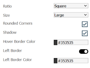
- Ratio
Control the aspect ratio of the tiles by selecting from:
The Tile Layout Preview displays the tile in the selected Ratio.
- Size
Choose the size of a tile by selecting from:
The height and width of each selection depends on the chosen Ratio.
The height and width is displayed, in pixels, on the Tile Layout Preview.
- Hover Border Color
Choose a hexadecimal color value to apply to the tiles border when it is hovered over.
- Left Border
Toggle to display a bar on the left hand border of a tile.
- Left Border Color
Choose a hexadecimal color value to apply to the left border.
Dashboard Tiles - Preview
Control the position of text and icons used on tiles in the appearance settings.
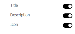
- Title
Toggle to choose if the tile title is to be displayed.
The title placeholder will be shown or hidden on the Tile Layout Preview.
- Description
Toggle to choose if the tile description is to be displayed.
The description placeholder will be shown or hidden on the Tile Layout Preview.
- Icon
Toggle to choose if the tile icon is to be displayed.
The icon placeholder will be shown or hidden on the Tile Layout Preview.
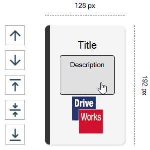
- Tile Layout Preview
The Preview of the tile layout shows the actual size and aspect ratio selected for the tile.
The position of each text block and icon can be controlled using the Move Up and Move Down arrows to the left hand side of the preview.
The vertical alignment of the text within the title and description placeholders can be adjusted by:
- Select the placeholder required to have its vertical justification changed in the preview window.
- Select the required justification arrow on the left hand side of the preview.
Preview
The Preview section shows a preview of how the current dashboard will look.
The toggle options allows the dashboard to be previewed in Phone, Tablet or Desktop modes.
The Menu section changes behavior of Dashboards that have been set to be displayed as a menu.
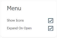
The Dashboard type is set when adding or editing a Dashboard.
See Add, Edit or Delete a Dashboard below for more information.
There are two settings available for Menu type dashboards:
Language
All DriveApps are designed to be translatable.
The default language is English, but each DriveApp has the ability to translate the text used into your
preferred language.
Expand to see how to set up languagesThe Language setting allows the DriveApp to translated into different languages.
The setting view will display all of the translatable text within the DriveApps.
There are two methods for translating the text:
- Manual - enter the translation for each piece of text individually.
- Bulk - export all of the text to a file, use a service to add translations and re-import into the DriveApp.
Manual Method
- From the Language drop down, select the language to translate into.
- From the list of text, select the row of text to be translated.
- Click Edit.
- Type the translation into the Translated Text box.
- Click update.
- Repeat from step 2 above for each piece of text to translate.
Navigate up and down the list of text using the arrows next to the Edit button.
Bulk Method
The easiest method to translate uses a .csv file to export the text.
This allows translation of all the text either individually or by using a translation service.
Export the text to a .csv file
- From the Language drop down, select the language to translate into.
- Click Export.
- Specify a Path to Export the .csv file to.
- Click the Export button.
- This will save the file to that location.
The Export dialog will switch to the Import tab.
Add translations to the .csv file (individually)
- Open the .csv file exported in the step 5 above.
Using a spreadsheet application (such as Microsoft Excel) will open the file in a readable format.
It will also allow the file to be saved in the correct format for importing back into the DriveApp.
- Add the translations to the cells in the Translation column.
- Save the file as CSV UTF-8 (overwriting the original exported file).
Please note:
The file must be saved as UTF-8 to allow for non-latin fonts.
- Close the file.
- Return to the Language setting in the DriveApp and click Import File in the Import dialog.
Note the Path to Import field is pre-populated with the location and file name the original export was given.
If the Import dialog (from step 5 above) was closed, it can be re-opened from the Language setting by clicking the Export button and then switching to the Import tab.
- The Import will begin.
This will take time, the import box will close when complete.
Do not interact with the DriveApp during the import.
Add translations to the .csv file (automatically)
This method uses Microsoft Excel to open and save the .csv file and Google Sheets to automatically translate each text item.
- Open the .csv file exported in the step 5 above.
Using a spreadsheet application (such as Microsoft Excel) will open the file in a readable format.
It will also allow the file to be saved in the correct format for importing back into the DriveApp.
- Select the DefaultText and Translation columns, copy to the clipboard.
- Open Google Sheets and paste the items above into a new blank sheet.
- Type the following rule in the first Translation cell:
=GOOGLETRANSLATE(A2,"en", "LangCode")
Replace LangCode with the Google Translate code for the language required.
Please see Google Translate Two-Letter Language Codes for a full list of codes.
- Press enter to apply the rule in the selected cell.
- Copy this rule to all other cells in the Translation column.
Grab the blue square in the bottom right of the cell and drag to the last cell in Google Sheets.
- Copy the two columns from Google Sheets and paste into the matching columns in the .csv file open in Microsoft Excel.
Microsoft Excel may display a message about the data being pasted not being the same size as the selection.
Click OK.
- Save the file as CSV UTF-8 (overwriting the original exported file).
Please note:
The file must be saved as UTF-8 to allow for non-latin fonts.
- Close the file.
- Return to the Language setting in the DriveApp and click Import File in the Import dialog.
Note the Path to Import field is pre-populated with the location and file name the original export was given.
If the Import dialog (from step 5 above) was closed, it can be re-opened from the Language setting by clicking the Export button and then switching to the Import tab.
- The Import will begin.
This will take time, the import box will close when complete.
Do not interact with the DriveApp during the import.
Dashboard Manager
The Dashboard Manager allows Dashboards to be created and edited.
It is also where the tiles that appear on each dashboard are applied.
Add, Edit or Delete a Dashboard
To add a new Dashboard:
- Click Add.
- Enter a Dashboard Name.
- Enter a Description.
- Select the Alignment for the text.
- Select Hide Header to hide the main header bar.
- Select Wrap Tiles to wrap the tiles in view when others become hidden.
- Select the Type of dashboard:
- Standard - displays all items on the dashboard as tiles in the main window.
- Menu - displays all items on the dashboard as a collapsible menu on the left of the main window.
- Upload an image for the background, if required.
- Click Save.
To edit an existing Dashboard:
- Select the Dashboard from the dashboard list.
- Click Edit.
- Change the required settings.
- Click Save.
To delete an existing Dashboard:
- Select the Dashboard from the dashboard list.
- Click Delete.
- From the Delete Dashboard confirmation dialog, click Delete.
Modify Tiles
Modify Tiles allows tiles to be added and positioned on the selected Dashboard.
A maximum of 12 tiles can exist on any dashboard.
To add a new tile to the dashboard:
- Select the Dashboard to add tiles to and click Modify Tiles
- Select an empty row in the list and click Add.
- Enter text to display on the Header of the tile.
- Enter a description.
- Select a Type for the tile.
See Tile Types for a description and extra fields added for each available Tile.
- Select the Background to be located on the tile, this can either be a default color or a
custom background (created in the Tile Background Creator setting).
- Select an Image (optional) - an additional smaller image that appears on top of the tile can be selected.
This field is not available for any KPI type tile.
- Select the Text Color - This can be toggled between Black or White.
- Select the Text Alignment - The options for the alignment are Left, Right, or Center and
this will be how the text appears on the tile.
- Select Permissions.
Permissions allows Teams access to the tile on the dashboard.
By default this is set to Allow All.
When a tile requires access for certain Teams only, they can be granted permission here.
Once Custom is selected, the single chevron can be used to move the currently selected
team to the allow column or the double chevron can be used to move all teams to the
allowed column (the same works in reverse).
- Visibility
Enter a rule to dynamically change the visibility of a tile.
- Click Save.
To Edit an existing tile:
- Select the Dashboard with the tiles to be edited and click Modify Tiles.
- Select the tile from the list and click Edit.
- Change the required fields.
- Click Save.
To Reposition a tile:
- Select the Dashboard with the tiles to be repositioned and click Modify Tiles.
- Select the tile from the list and click Move Up or Move Down.
To Delete a tile:
- Select the Dashboard with the tiles to be deleted and click Modify Tiles.
- Select the tile from the list and click Delete.
Tile Types
The Types of Tile that can be added are as follows:
- Dashboard
This will add a field named Dashboard.
Select the Dashboard that will be loaded when this tile is selected
- DriveApp
This will add fields named DriveApp and Additional Data.
DriveApp is the DriveWorks DriveApp that will be loaded when the tile is selected.
Data is text that will be passed into a constant called Data on the selected DriveWorks DriveApp.
- DriveWorks Project
This will add fields named Project, Data, Macro Name and Macro Argument.
Project is the DriveWorks Project that will be loaded when the tile is selected.
Data is the text that will be passed into a constant called Data on the selected DriveWorks Project.
Macro Name is the name of a macro to run in the DriveWorks Project.
Macro Argument is an optional argument provided to the macro, see Macro Argument for more information.
- Embedded
This will add fields named DriveApp and Start Parameter.
DriveApp is the DriveWorks DriveApp that will be loaded when the tile is selected.
Start Parameter
- Hyperlink
This will add a field named URL.
Enter the URL for the hyperlink to navigate to.
- KPI
This will remove the Image field and add a field named KPI.
KPI Name is the KPI that you want to be displayed on the tile. Next to
Background, there will also now be a Use KPI Settings button which will pull
through the Background and Text Color of the KPI to be used on the tile if
required.
- KPI & Dashboard
This will remove the Image field and add fields named KPI and Dashboard.
KPI Name is the KPI that you want to be displayed on the tile. Next to
Background, there will also now be a Use KPI Settings button which will pull
through the Background and Text Color of the KPI to be used on the tile if
required.
Dashboard is the Dashboard that will be loaded when this tile is selected
Tile Types (continued)
The Types of Tile that can be added are as follows:
- KPI & DriveApp
This will remove the Image field and add fields named KPI, DriveApp and Data.
KPI Name is the KPI that you want to be displayed on the tile. Next to
Background, there will also now be a Use KPI Settings button which will pull
through the Background and Text Color of the KPI to be used on the tile if
required.
DriveApp is the DriveWorks DriveApp that will be loaded when the tile is
selected.
Data is text that will be passed into a constant called Data on the selected
DriveWorks DriveApp.
- KPI & DriveWorks Project
This will remove the Image field and add fields named KPI, Project and Additional Data.
KPI Name is the KPI that you want to be displayed on the tile. Next to
Background, there will also now be a Use KPI Settings button which will pull
through the Background and Text Color of the KPI to be used on the tile if
required.
Project is the DriveWorks Project that will be loaded when the tile is selected.
Additional Data is the text that will be passed into a constant called Data on the selected
DriveWorks Project.
- KPI & Hyperlink
This will remove the Image field and add fields named KPI and URL.
KPI Name is the KPI that you want to be displayed on the tile. Next to
Background, there will also now be a Use KPI Settings button which will pull
through the Background and Text Color of the KPI to be used on the tile if
required.
The property URL will be added where the required hyperlink for the tile to
redirect to can be entered.
- List
This will add fields named List, Macro Name and Macro Argument and allows a list to be selected to be displayed on the KPI.
Macro Name is the name of a macro to run when the list is launched.
Macro Argument is an optional argument provided to the macro, see Macro Argument for more information.
Macros are set up in lists created from the CPQ Custom Item template.
Lists are set up in the List Manager.
- List - Add Record
This will add a field named List and allows an add record list to be displayed on the KPI.
Tile Background Creator
Create a Tile with a custom image.
Expand to see how to create tile backgroundsThe Tile Background Creator consists of two tiles:
KPI Settings
This displays a list of default KPIs.
Each has a description of what KPIs they will report.
The search bar located above the Table to the left, can be used to search the existing KPIs by name.
The KPIs can be filtered by Category using the Category drop down.
Expand to see how to change KPI settingsOn the right of the KPI Table, there are four icons:
- Refresh
This is used to refresh the list of KPIs as well as clear the search and category’s filters.
This is useful if multiple users are editing KPIs at the same time.
- Add
Will add a new KPI.
- Click Add.
This will open the KPI Editor.
Click the Help button at the top of the editor for more information on the information each section requires.
- In the Name tab enter:
All fields require completing.
- Name
This is the name the KPI is referred to in the search bar for the KPI table and the name the KPI is referred to when adding it to a tile on a Dashboard.
- Category
This is the category that the KPI will be linked to, this can either be a new category (this will appear in the category drop-down list) or a default category.
Default categories include:
- Documents
- Machines
- Models
- Specifications
Categories are not case sensitive.
- Description
This is the description of the KPI and will be displayed in the KPI Table, the description can also be displayed on the tile if required by selecting the Visible option.
- Visible
Select if the Description is to be displayed on the tile.
- In the Title tab enter:
When the Visible option is selected all fields will require completing.
- Visible
Select if the Text is to be displayed on the tile.
- Text
Enter the text you want to be displayed on the KPI.
- Color
Enter a Windows color (for example Black) or a hex color code (for example #000000).
- Font Size
Enter the font size in points (for example 12).
- Top Align - Bottom Align
Toggle between top aligned or bottom aligned.
- Font
Enter any font installed on the machine running DriveWorks (for example Arial).
- Font Style
Enter any font styles to be applied (for example Bold).
- In the Data tab enter:
- Type
The format of the KPI data. Either Table, Value or Percentage.
- Refresh Rate
How often you want the KPI to refresh the data displayed in minutes.
- Type Data
The DriveWorks Rule to calculate the data to be rendered by the KPI.
Build the Rule in DriveWorks Administrator and then copy and paste it into the KPI Data field.
When Type is Table enter a rule in the Table field.
When Type is Value enter a rule in the Value field.
When Type is Percentage enter a rule in the Numerator and Denominator field.
- In the Colors tab:
The Colors tab allows the color of the text that will be displayed on the KPI Tile to be selected.
The fields displayed are dependent on the Type that has been chosen from the Data section.
- Background
Select a color for the background when the KPI is displayed on a tile.
This color will only be used when the KPI is displayed on a tile and the Tile Setting - Use KPI Setting is selected.
- For Table (selected from the Type field in the Data tab)
Enter colors for the table Grid Line, Header and Text.
Accepted values for Color properties are valid Windows colors (for example Black) or a hex color code (for example #000000).
- For Value (selected from the Type field in the Data tab)
Enter a Value Color for the displayed text.
Accepted values for Color properties are valid Windows colors (for example Black) or a hex color code (for example #000000).
- For Percentage (selected from the Type field in the Data tab)
Enter colors for Color1, Color2 and Color3
Accepted values for Color properties are valid Windows colors (for example Black) or a hex color code (for example #000000).
Rules applied to the corresponding Rule field will result in that color being applied.
- In the Fonts tab enter:
- Font - Enter any font installed on the machine running DriveWorks (for example Arial)
- Size - Enter the font size in points (for example 12)
- Style - Enter any font styles you want to apply (for example Bold)
- Click the Preview tab to view a preview of how the KPI will look on a Dashboard.
- Edit
By default, the edit icon will be disabled until a KPI is selected from the list.
This will load the KPI Editor and allow you to change any of the settings of any pre-created or custom KPI.
- Delete
By default, the delete icon will be disabled until a KPI is selected from the list.
When selected, the delete icon will immediately delete the selected KPI from the list.
This action cannot be undone.
List Manager
A DriveApp List is a view of a table of data into which items can be added, edited or removed.
The Dashboard DriveApp uses Lists to allow administration of Teams and Users
The List Manager allows Lists to be applied that will be displayed on Dashboard Tiles.
Expand to see how to edit the List ManagerThe List Manager will display a view of the default Lists.
The following icons appear at the top of the list:
- Add
- Click Add to create a new list.
- In the Adding List window, enter a List Name.
- Select a Data Provider from:
- DriveApp-List-DataProvider
This requires a List-DataProvider Project to be set up using the List-DataProvider Template.
- DriveApp-Security-Teams-DataProvider
Will display the Teams Administration list when selected from the running dashboard.
- DriveApp-Security-Users-DataProvider
Will display the Users Administration list when selected from the running dashboard.
- User Defined
This option is currently reserved for a future service pack.
- Edit
Select the list to edit, from the list view, and click edit.
The Editing List window displays the same fields as the Adding List window described above.
- Delete
Select the list to delete, from the list view, and click delete.
Online Help
This links to the online version of this page.