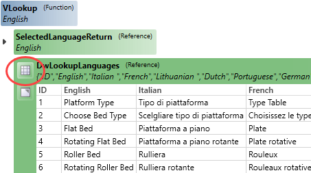
Table Visualization
Tables and arrays used in any rule can be visualized directly in the Rule Builder.
This assists with easily identifying the correct columns and rows are used in the rule.

Release Notes
SOLIDWORKS 2022, 2023 and 2024 are fully supported.
Microsoft Windows 10 and 11 are fully supported.
Focused visual updates and enhancements add further functionality across DriveWorks.
Tables and arrays used in any rule can be visualized directly in the Rule Builder.
This assists with easily identifying the correct columns and rows are used in the rule.

Organize Constants into Categories and Sub-Categories.
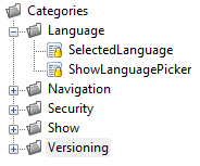
Images used for Variable Categories can have a size mode applied.

All Projects within the same Group can be styled with a single css file.
See Group Level Styling for more information.
The White-Label Project Template creates a new Project that is responsive and can be easily modified to match your organization's branding and configurator requirements.
The following control icons have been updated in the Form design Control Toolbox:
 3D Preview Box
 Frame Control
New features to further the Design Automation capability.
Control the Blind Depth of a Cosmetic Thread.
Control the Flip alignment of a Coordinate System.
Skip instances of a Derived Pattern.
Drive parameters of the Lofted Bend feature.
Allows the master path of the captured file to be swapped with another uncaptured master file when using SOLIDWORKS PDM Professional.
Additional functionality for your user experience.

The Toggle Switch allows on or off (yes or no) selections to be made with a modern look and feel.
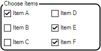
The Check Box Group allows multi-selection of a group of static or dynamic items.

The Clipboard Button allows the contents of a targeted control to be copied to the clients clipboard on any device.
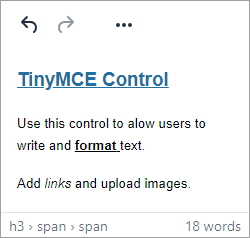
The TinyMCE Control is a rich text editor for textual input that supports image upload.
Web Form Technology has enabled the addition of form control properties to completely style controls for a completely modern look.
More elements of Controls can have a color applied, along with (where applicable) the state of a control (Hover, Disabled, Pressed, Focus, checked)
Apply border radius to controls for a modern styling.


Add a border to the Hyperlink or Label control.
Specifies the width of the control's border.
Available for 3D Preview Box, Data Table, Dialog Button, Hyperlink, Label, Macro Button and Upload Control.
Set the size of the icon shown on the Spin Button Control.
The Spin Button allows a choice between the following to display for the icon:


The Spin Button allows a choice between the following to layout the button icon:


Set the Button Width of the Spin Button.
Specifies the spacing between inputs in the control.
Sets the space between the input and unit elements

Sets the space between the thumb (grab handle) and unit elements

Sets the space between the input and button elements

The Padding property controls:
Specifies the opacity when the control is in a disabled state.
Opacity (Disabled)Controls the size of the check in the Check Box control or the size of the radio in an Option control.
Specifies whether the context menu to copy from the Data Table control is enabled.
Allow CopySpecifies if a filler column is appended at the end of each row to fill the remaining control width.
Available for Child Specification List, Data Table and Item List controls.
Controls the vertical alignment of text and header text in the control.
Controls whether the text is vertically aligned to the top, bottom or center. If a picture is displayed, the text is aligned vertically center.
Specifies whether the control's content is vertically aligned to the top, bottom or center of its bounds.
Macro Argument and On Change Events properties have been added to the controls:
To accommodate the addition of all these new properties, Appearance Properties are now organized into the following categories in the Control Property Grid:
Improvements to make interactive 3D visualizations, for the desktop and web, realistic and performant
Add a ground plane and any pre-defined Camera, Lighting templates when creating a new DriveWorks 3D Document.
The Extrusion entity allows geometries to be generated from a set of given paths.
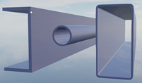
Polygon functions have been added to easily create the shapes that can be extruded.
See New and Enhanced Functions and Tasks below.
Adds a basic plane model to the scene to act as the ground or base, to place models on and receive shadows.
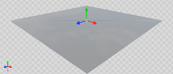
Select from a range of Tone Mapping types for greater control over the overall look and feel of the DriveWorks 3D scene.
Keyboard shortcut - Duplicate a node with Ctrl + d.
The Scale of Imported Geometries can be set.
The Feature Panel allows Filtering by entity type.
Upgrade all drive3d files stored in a folder (and sub folders) to take advantage of the latest performance benefits in the 3D Viewer.
Additional functionality for your user experience.

Use with the Fill and Hole Path parameters of the 3D Extrusion entity to combine two or more polygons.
See PolygonCombine for more information.

Use with the Fill and Hole Path parameters of the 3D Extrusion entity to create a new box polygon.
See PolygonCreateBox for more information.

Use with the Fill and Hole Path parameters of the 3D Extrusion entity to create a new circular polygon.
See PolygonCreateCircle for more information.

Use with the Fill and Hole Path parameters of the 3D Extrusion entity to create a new rounded box polygon.
See PolygonCreateRoundedBox for more information.

Use with the Fill and Hole Path parameters of the 3D Extrusion entity to create a new polygon by creating the outline of a given series of points.
See PolygonCreateThickLine for more information.

Use with the Fill and Hole Path parameters of the 3D Extrusion entity to create a new polygon created from the given list of points.
See PolygonFromPoints for more information.

Use with the Fill and Hole Path parameters of the 3D Extrusion entity to create a copy of the given polygon rotated around its local origin.
See PolygonRotate for more information.

Use with the Fill and Hole Path parameters of the 3D Extrusion entity to create a copy of the given polygon scaled along the X and Y axes.
See PolygonScale for more information.

Use with the Fill and Hole Path parameters of the 3D Extrusion entity to create a polygon that forms a cardinal spline path along the given polygon's points.
See PolygonSpline for more information.

Use with the Fill and Hole Path parameters of the 3D Extrusion entity to create a copy of the given polygon translated along the X and Y axes.
See PolygonTranslate for more information.

BorderRadius assists in creating the format required to apply a rounded edge for the Border Radius Property.
PDMBasicSearch enhanced by including an option to search only the latest versions of files.
HTMLSanitize cleans HTML to prevent XSS attacks..
Send HTTP Request Task supports the Accept Request Verb.
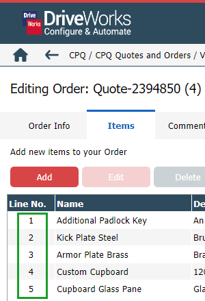
A sequence has been added to Order Item views inside the CPQ DriveApp and basket view of the Embedded CPQ DriveApp making it easier to identify line items.
CPQ DriveApp has the ability to copy existing order line-items this includes standard, custom and linked items.
Deleting a Custom Item will now trigger a Specification Flow Operation CPQDelete.
This Operation can be customized to perform the required tasks on deleting the item.
For example, removing data from an external source. For any custom linked items, the CPQDelete Operation will also be triggered.
CPQ DriveApp allows the columns and properties , displayed in the Orders Table, to be controlled.
New Dashboard type menu allows you to display dashboard items as a scrollable, multi-level menu with the selected content displayed in the main area.
Each Dashboard's type can be set in the DriveApp Dashboard Manager. This can be set to Standard or Menu.
CSS Styling has been to Standard Dashboard Tiles including border radius, border hover and box shadow.
These can be controlled in the DriveApp Settings and have been enabled by default.