Appearance
- Background Color
Specifies the color of the control's background.
- Opacity
Specifies the opacity of the control.
Requires a value between 0 (not visible) and 100 (fully visible).
- Padding
Specifies the padding of the control.
The Label displays text on the user form.
The text can be static or can change dynamically by building a rule on the Text property.
When the form control is applied the name entered will display as the caption for the form control. This can be changed by selecting the Text property.
Color Properties
When applying any color property please see the advice given for using Web Safe Colors below.
Specifies the color of the control's background.
Specifies the opacity of the control.
Requires a value between 0 (not visible) and 100 (fully visible).
Specifies the padding of the control.
Specifies the color of the control's outer border when the 'SingleLine' border style is selected.
Specifies the border radius of the control.
Configures the border style of the control.
Specifies the width of the control's border.
Specifies the font of the text shown in the control.
Specifies the color of the control's text.
Controls whether the text is horizontally aligned to the left, right or center
Controls whether the text is vertically aligned to the top, bottom or center. If a picture is displayed, the text is aligned vertically center.
Controls whether the control is enabled (if the result is TRUE) or disabled (if the result is anything other than TRUE, e.g. FALSE).
Determines whether the value of the control is in error. The result of this rule is a string containing the error message if the value is in error, otherwise a blank string or the number zero.
Configures the position of the control in the form tab order.
Specifies the text shown in the control.
See Formatting the Displayed Text for information on how the displayed text can be formatted.
Determines whether the control is visible (TRUE) or hidden (FALSE).
Optional text which can be used to provide information belonging to or about a control. For example, a list of CSS classes which can be parsed and applied to the control using the Integration Theme in DriveWorks Live. This doesn't affect the control's behavior.
The name of the control
Optional text which can be used to describe the control, but which doesn't affect the control's behavior.
Controls the duration, in seconds, for which the tooltip will remain visible. Values of 0 and below indicate an infinite duration.
Specifies the text to display in a tooltip when hovering over the control.
See Formatting the Displayed Text for information on how the displayed text can be formatted.
When selecting a color, we strongly recommend using colors selected only from the Web or Custom tabs, or manually entering as a hexadecimal value (for example #000000 for black).
Named colors selected from the System tab (for example ControlText) are very unreliable.
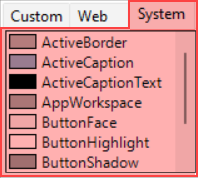
System colors will vary per browser, and/or the user's chosen color scheme.
System colors were deprecated in CSS 2.1, and should be avoided.
Default Property values previously using System colors (for example ControlText) were replaced with safe alternatives in DriveWorks 22.0.
New Controls made from this version onwards will no longer use System colors by default.
Existing Controls created before this version will use the old defaults, we suggest existing controls that use System colors are replaced with alternative web safe values.
For example:
ControlText → Black
The text displayed in the Text and Tooltip Text property support the use of formatting tags to format parts of the text string.
The supported tags are:
For example:
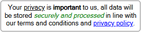
See How To: Format Text for more information.
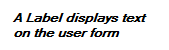
A user form control that displays text.