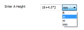
Appearance
- Background Color
Specifies the color of the control's background.
- Input Background Color
Specifies the background color of the control's input area.
- Input Background Color (Disabled)
Specifies the background color of the control's input area when the control is disabled.
- Input Background Color (FOCUS)
Specifies the background color of the control's input area when in a focused state.
- Input Background Color (Hover)
Specifies the background color of the control's input area when in a hovered state.
- Input Opacity (Disabled)
Specifies the opacity of the control's input area when the control is disabled, between 0 and 100.
- Input Padding
Specifies the padding of the control's input area.
- Input Spacing
Specifies the spacing between inputs in the control.
- Unit Background Color
Specifies the background color of the unit select.
- Unit Background Color (Disabled)
Specifies the background color of the unit select when the control is disabled.
- Unit Background Color (Hover)
Specifies the background color of the unit select when in a hovered state.
- Unit Icon Color
Specifies the color of the icon in the unit select.
- Unit Icon Color (Disabled)
Specifies the color of the icon in the unit select when the control is disabled.
- Unit Icon Color (Hover)
Specifies the color of the icon in the unit select when in a hovered state.
- Unit Padding
Specifies the padding of the unit select.
