To add a new Form Control to the form displayed in the Form View:
- Select the required control from the Control Toolbox on the Command Bar.
- Enter a name for the control.
- Click OK
Caption
Most controls (but not all) will display a caption when added.
This can be modified from the Control Properties by setting the Caption or Text property.
By default the caption takes the name given to the control when the control is created (not on renaming the control).
As control names cannot include spaces, capitalized words are automatically separated with a space for the Caption.
For example:
When the name shown in the image below is given to a control.
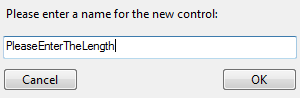
The Caption displayed will be:
Please Enter The Length
Control Guides
Control Guides allow quick and accurate alignment of controls when designing User Forms.
Control Guides appear when controls are moved on the User Form.
Control Guides align to other controls in two ways:
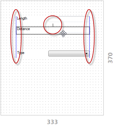
- Margin Guides - Snap a set distance away from another control.
- Alignment Guides - Snap to the edges of another control.
Control Guides can also snap to any Resolution Guide in use on the User Form.
Adjust Control Guide Settings
Control Guides settings allow the following properties to be changed to suit your preferences.
- Enable/ Disable.
- Margin and Alignment Guide Color.
- Snap Range.
See Settings to access the Settings dialog and Form Designer Settings for more information on Control Guide Settings.
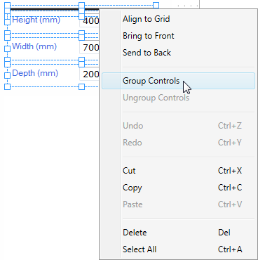
Group Controls
Form Controls can be grouped so they move as one to reposition in the form view.
Selecting grouped controls from the form, will display the following in the property panel:
- All properties common to each control in the group.
- All property values common to each control in the group.
- Where a property is common but the value is not, the values will not be displayed.
Changing a property value will apply that value to all controls in the group (when all controls in the group are displayed as selected on the form).
A grouped control can be isolated (to change a property for that control only) by double clicking the control on the form.
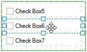
To Group Controls
Controls can be grouped by:
- Select two or more controls from the same User Form.
- Right click on one of the selected controls.
- Select Group Controls from the menu.
To Ungroup Controls
Controls can be ungrouped by:
- Selecting a group of controls from the User Form.
- Right click on the group.
- Select Ungroup Controls from the menu.
Keyboard Positioning
Accurate Positioning of Form Controls Using Keyboard Arrows.
To fine-tune a controls position, use the keyboard arrow keys to move the selected control one pixel at a time.
- Select a single control or multiple controls to be moved.
- Press and hold the Alt key on the keyboard and the arrow key that corresponds to the direction the control is to be moved.
- Alt +
 - Move the control(s) 1 pixel up.
 - Alt +
 - Move the control(s) 1 pixel left.
 - Alt +
 - Move the control(s) 1 pixel down.
 - Alt +
 - Move the control(s) 1 pixel right.
Multi-Select
Multiple form controls can be selected by the following methods:
- Fence Selection - Click in a blank area of the form and drag a fence around the controls to be selected.
- Ctrl or Shift Select - Select a control and then hold the Ctrl or Shift key down to select other controls.
When multiple form controls are selected from the form designer all properties that are shared between the controls will be displayed in the property list.
Also if any properties have the same value or rule, this will be displayed in the property list.
The Property Panel consists of two sections that interact with each other and the Form View:
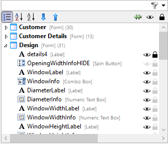
Control Tree
All controls that exist on each Form are listed in the Control Tree.
The Control Tree provides a single place for finding form controls and easily navigating to the form the control exists on.
Selecting a Control from the list will:
- Display all Properties for the selected Control in the Property Grid below
- Highlight the Control with positioning grips in the Form Design Area
The Form View will switch to the form the selected control exists on.
Control Tree Order
Each control is listed under the form on which they appear, the list can be ordered by:
- Z-Index (Default order)
- Name
- Type
Order by Z-Index
The Z-Index specifies the stack order of a control on a user form.
Controls that appear higher in the list appear further back (behind) on the user form.
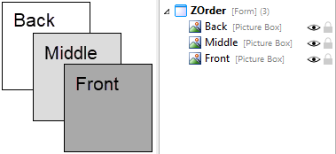
The Z-Index order allows easier organization of controls that overlap or that are placed over each other.
Click the Order by Z-Index button  to order the controls by the Z-Index.
Changing the Z-Index of a control
There are two methods by which the Z-Index of a control can be modified:
- Using the tools available at the top of the control tree window.
- To do this select the control to be moved from the control tree.
- Click the Bring Control Forward
 or Send Control Back button
- Drag and Drop the control into position in the control
tree.
- To do this click and hold on the control to be moved and drag
to its required z order position.
Order by Name
Each control can be ordered by the Name given to the
control.
Click the Order By Name button
 to
order the controls in each form by the Name given to them.
to
order the controls in each form by the Name given to them.
Order by Type
Each control can be ordered by the type of control (Text Box,
Combo Box, Label etc.)
Click the Order By Type button
 to
order the controls by their type.
to
order the controls by their type.
Toggle design mode visibility
Design Mode Visibility allows a control to be hidden during
design mode only. This is useful when controls are positioned on
top of others and require to be turned off to allow easier
selection of the controls behind.
Design Mode
Visibility does not override the Visible property of the control.
When running a project the visibility of a control will always use
the Visible property result.
Select the control to have its visibility turned on or off and
click the Toggle Design Mode Visibility button

Lock control position
Once the position of a control is determined its position can be
locked to prevent accidental moving during Form Design.
Select the control to be locked and click the Toggle Locking
Control Position button
 .
.
Collapse All
All forms that exist in the project can be quickly brought back
into view by clicking the Collapse All button
 to collapse the controls in view on each form.
Filter
Controls can be quickly found by using the filter box above
the control tree.

Clearing the Filter
Once a filter has been applied it can be cleared by:
- Removing the characters from the Filter box by using the backspace or delete keys on the keyboard.
Or
- Clicking the clear button from the filter box (The red cross that appears once characters are entered).

Move Controls To Another Form
If a control has been placed onto a form and now requires to be on another form it can be dragged from its existing form onto the new form all from within the Control Tree.
- Expand the forms within the Control Tree so the control to be moved and the controls on the form it is to be moved to are in view.
- Select the control to be moved and then left click and hold to drag.
- Drag the control to the required form.
Clipboard, Undo and Search
This group of commands provide common Windows functionality for:
- Cut, Copy, Paste
Cut, Copy and Paste controls from one form to another.
Can also be used to copy controls across different Projects.
The pasted control name will be incremented if the original name already exists in the Project.
- Undo and Redo
Will undo or redo the previous actions.
- Search Rules
Provides the ability to search and edit all Rules within the Project, see Search Rules for more information.
Zoom
The Form in view can have the zoom level set by selecting the required buttons from the command bar.
- Zoom +
Increases the zoom level, in 10% increments, to maximum 500%
- Zoom -
Decreases the zoom level, in 10% increments, to a maximum of 20%
- Reset Zoom
Resets the zoom scale to 100%.
This option is only available when the Form in view is not at 100%.
100% is the level that the User Form will always be displayed at when in a Specification.
The above options are also available by right clicking on the User Form.
Zoom Level
When the zoom level is not 100% the current zoom level is indicated at the top right of the Form Designer.
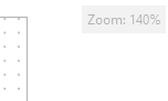
The zoom level is hidden when the current view is at 100%.
Test
You can use the Test button on the Command Bar to the current form, and to set default values for controls.
Data can be entered into or selected from the controls.
Button controls (Macro, Dialog, etc.) or controls that require a button to be selected (Child Specification List, Item List etc.) will not run in Test Mode.
Alignment
To align two or more Form Controls, either box select (by click-dragging over the controls you want to align), or ctrl-select them individually, and then select the relevant alignment button.
The following alignment tools are available:
- Align Left
- Align Center
- Align Right
- Align Top
- Align Middle
- Align Bottom
- Equalize Width
- Equalize Height
- Equalize Vertical Spacing
- Equalize Horizontal Spacing
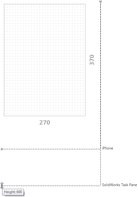
Resolution Guides
Resolution Guides help you to design User Forms within a specified boundary.
These are particularly useful when designing your User Forms for use on a common device.
There are a number of preset resolution guides available, these are:
- iPhone 5 Portrait
- iPhone 5 Landscape
- iPhone 2/3 Portrait
- iPhone 2/3 Landscape
The width and height of the presets match the screen resolution of the products they are named after, these can be adjusted on creation.
Add a Resolution Guide
To add a Resolution Guide:
- Select Form Design from Stage 2: User Interface.
- Click the Add Resolution Guide button.

- Enter a Name, Width and Height for the guide or select from the list in the Templates drop-down.
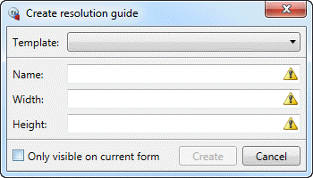
- Click Create. The Resolution Guide will be applied to all User Forms.
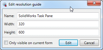
Edit a Resolution Guide
To edit a Resolution Guide:
- Right click on either the start or end Node of the guide.
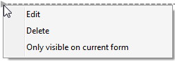
- Select Edit from the menu.
- Make the required changes in the Edit resolution guide dialog.
Delete a Resolution Guide
To delete a Resolution Guide:
- Right click on either the start or end Node of the guide.
- Select Delete from the menu.
Resolution Guide Settings
Resolution Guides can have further settings applied.
See Settings to access the Settings dialog and Form Designer Settings for more information on Resolution Guide Settings.
3D Preview Box
Allows an interactive 3D Model to be displayed during specification.
 3D Preview Box
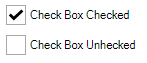
Check Box
Allows Yes or No selections to be made by checking or unchecking the input area.
 Check Box
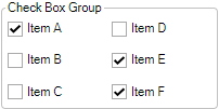
Check Box Group
Allows multi-selection of a group of static or dynamic items.
 Check Box Group
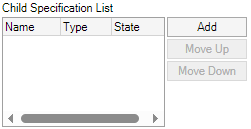
Child Specification List
Allows Projects to be specified as Child Projects and supports passing of data between parent and child.
 Child Specification List
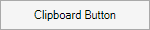
Clipboard Button
Allows the contents of a targeted control to be copied to the clients clipboard on any device.
 Clipboard Button
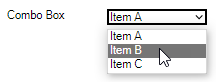
Combo Box
Allows an item to be selected from a drop down list.
 Combo Box
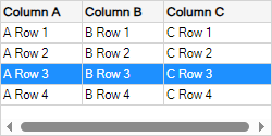
Data Table
Allows data, from an array, table or database, to be filtered, sorted and selected.
 Data Table
Date Picker
Allows a date to be selected from an interactive calendar.
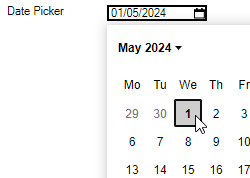
 Date Picker
A button that allows a Form to be presented as a dialog.
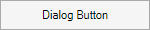
 Dialog Button
Frame Control
Allows any Form that exists in the Project to be displayed within it. Used widely for modular form design.
 Frame Control
Hyperlink
Allows a URL to be navigated to.
 Hyperlink
Item List
Allows items, specified from a Form, to be displayed in a list.
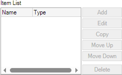
 Item List
Label
Provides a way of displaying fixed or dynamic text on a form.

 Label
Label
List Box
Allows an item to be selected from a list.
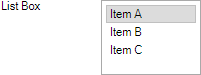
 List Box
Runs a Specification Macro when clicked in the Specification.
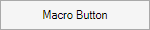
 Macro Button
Measurement Text Box
Allows conversion between different measurement units.
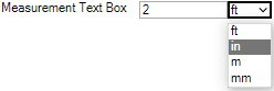
 Measurement Text Box
Numeric Text Box
A text box with enhanced support for numeric input within a fixed or dynamic range of values.

 Numeric Text Box
A single option that can be grouped with other Option Buttons outside a frame and across different forms.
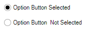
 Option Button
Option Group
A list of options grouped within a single frame.
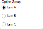
 Option Group
Picture Box
Displays a picture whose path can either be a fixed or dynamic value.
 Picture Box
Slider
Displays a bar with an indicator that can be dragged to represent a numeric unit.
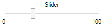
 Slider
Specification Host
Allows hosting of a Specification or a Child Specification.
 Specification Host
Incrementally step through values.
 Spin Button
Text Box
Allows text to be entered.
 Text Box
TinyMCE Control
A rich text editor for textual input that supports image upload.
 TinyMCE Control
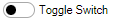
Toggle Switch
Allows on or off (yes or no) selections to be made.
 Toggle Switch
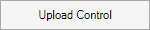
Upload Control
Allows a client side file to be uploaded.
 Upload Control
Web Frame
Allows HTML, a URL or a PDF file to be rendered onto the form.
 Web Frame
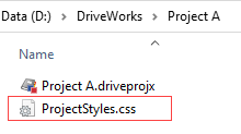
Project Level Styling
Each Project requires a file named ProjectStyles.css located in the same folder as each Project.
Group Level Styling
ALL Projects within a Group can be styled identically with a single GroupStyles.css file.
The Group requires a file named GroupStyles.css located in the Group Content Folder.
This is the same file as the ProjectStyles.css, but renamed to be GroupStyles.css.
Obtain an example CSS File
DriveWorks provides an example CSS file that can be modified to suit your requirements.
The ProjectStyles.css file is obtained by:
- Create a New Project.
We recommend creating a New Individual Group to store this Project, away from any Production or Development environment.
- In the New Project wizard, from the Templates section select:
Both of these templates provide styling for:
- Each control
- Animation (for controls where layout properties dynamically change)
Click Next.
- Select a Location and Name for the new Project.
Click Next.
Click Finish.
- Browse to the location the new Project was created and copy the ProjectStyles.css file to the same location as the Project(s) it is to be applied.
We recommend experimenting on a single Project and then copying the ProjectStyles.css to all other required Projects when satisfied with the results.
To use this file for Group Level Styling:
- Locate the ProjectStyles.css created in step 4 above.
- Copy this to the Group Content Folder, applied to the Group.
- Rename the file in this location to GroupStyles.css.
Modifying The CSS File
The ProjectStyles.css or GroupStyles.css file can be modified 'live', using any text editor (Visual Studio Code, Notepad++, etc.), while in the Form Design task.
Saving the modifications in the text editor will instantly update the Form Designer with the changes.
For more information on CSS selectors, see: Mozilla - Attribute selectors.
Target An Individual Control
An individual control can be targeted to specific code in the CSS file by applying a value to the data-metadata tag (in the CSS) and using that value in the (Metadata) property of the control.
For example the CSS file contains the following:
[data-metadata*="animate"] {
  transition: all var(--animation-speed) var(--animation-curve);
}
Where the Control's (Metadata) property contains the value animate - by partial matching.
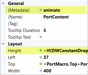
Apply the value animate, to the (Metadata) property of each control that is to be animated when its layout properties change.
For example' the image below shows the animate value applied to the (Metadata) property of a Frame Control, where its Height property dynamically changes when a Macro button is clicked (which in turn drives a Constant value).
Resources
Useful CSS Tutorials
Helpful References
User Forms can be exported as a template, for re-using in other Projects.
User Form template creation allows data within a Project to be included in the template.
Multiple User Forms can be included in the template. Use Ctrl + select to choose the required User Forms from the Forms List.
- Select the User Form(s) to be exported.
- Click the Export Form As Template button from the command bar.
- Enter Template Details:
- Select Project Constants.
This lists all Constants in the Project. Constants can be selected individually or all at once (right click, Select All).
- Select Project Variables.
This lists all Variables in the Project. Variables can be selected individually or all at once (right click, Select All).
- Select Calculation Tables.
This lists all Calculation Tables in the Project. Calculation Tables can be selected individually or all at once (right click, Select All).
- Select Specification Macros.
This lists all Specification Macros in the Project. Specification Macros can be selected individually or all at once (right click, Select All).
- Select Additional Content.
This allows any other file to be selected for inclusion in the template.
Its primary purpose is to allow the inclusion of images, DriveWorks 3D files.
Do not include Individual Group or Project files, temporary files, other templates, etc.
Once the template has been created, it must be installed on each DriveWorks Administrator machine it is required to be added from.
DriveWorks templates can only be installed on machines that have DriveWorks Administrator installed.
- Locate the template created above, for example this will be:
<SaveLocation><TemplateName>.drivefort
- Double click the file.
- Follow the steps in the Install wizard.
To add the template to a Project, see Creating a Form from a Template.
Pre Built Templates
DriveWorks includes pre-built templates that provide a starting point to quickly build adaptive forms that respond when viewed on different devices.
See Creating a Form from a Template for more information.