Dialog Button
The Dialog Button displays a button on the user form that when clicked will launch a user form as a dialog.
The name of the dialog form to launch is set in the Dialog Name property. The value must equal the name given to a user form in the form navigation stage; for example:
"MyDialogForm"
A user form must exist that is not part of the main form navigation.
When the form control is applied the name entered will display as the caption for the form control. This can be changed by selecting the Text property.
Limitations of the Dialog Button
Properties
Appearance
Appearance - Border
Appearance - Picture
Appearance - Text
- Font
Specifies the font of the text shown in the control.
- Text Color
Specifies the color of the control's text.
- Text Color (Disabled)
Specifies the color of the control's text when the control is disabled.
- Text Color (Hover)
Specifies the color of the control's text when the control is in a hovered state.
- Text Color (Pressed)
Specifies the color of the control's text when the control is in a pressed state.
- Text Horizontal Alignment
Controls whether the text is horizontally aligned to the left, right or center
Behavior
- Dialog Name
Determines which dialog to show.
- Enabled
Controls whether the control is enabled (if the result is TRUE) or disabled (if the result is anything other
than TRUE, e.g. FALSE).
- Error Result
Determines whether the value of the control is in error. The result of this rule is a string containing the
error message if the value is in error, otherwise a blank string or the number zero.
- Tab Index
Configures the position of the control in the form tab order.
- Task List Enabled
Specifies whether to enable the task list for a dialog.
- Visible
Determines whether the control is visible (TRUE) or hidden (FALSE).
General
- (Metadata)
Optional text which can be used to provide information belonging to or about a control. For example, a list
of CSS classes which can be parsed and applied to the control using the Integration Theme in DriveWorks Live.
This doesn't affect the control's behavior.
- (Name)
The name of the control
- (Tag)
Optional text which can be used to describe the control, but which doesn't affect the control's behavior.
- Tooltip Duration
Controls the duration, in seconds, for which the tooltip will remain visible. Values of 0 and below indicate
an infinite duration.
- Tooltip Text
Specifies the text to display in a tooltip when hovering over the control.
Layout
- Height
Controls the height of the control.
- Left
Controls the left position of the control.
- Top
Controls the top position of the control.
- Width
Controls the width of the control.
Differences Between Client Applications And Browser
The User Form launched by the Dialog Button is displayed differently in the client modules (Administrator, User,
etc.) and when viewed in a browser.
This is to overcome the possibility of a browser blocking pop-ups.
Client Applications
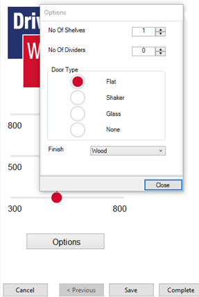
When the Dialog Button launches a User Form from the Specification Explorer in DriveWorks Administrator, User,
Autopilot or Live (client applications), the User Form will be displayed in front of the Form it was launched from.
A Close button will be active at the bottom of the Form.
Closing the Form (clicking Close) will return the user to the previous Form.

Browser Applications
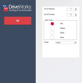
When the Dialog Button launches a User Form when displayed in a browser (Chrome, Edge, Firefox, etc.), the User Form
will be displayed just as any other User Form.
If the Form uses Standard Navigation an OK button
will be active in the Navigation area.
When Standard Navigation is not used, In Form Navigation should be
implemented.
Closing the Form (clicking OK) will return the user to the previous Form.

Learning Resources
Tech Tips
This example demonstrates how to simulate a Dialog, or pop-up, using a Frame Control and Macro Buttons.
Dialog FormTech Tips Index
View all available MyDriveWorks Tech Tips.
DriveWorks Tech Tips IndexBuilding a Dialog or Pop-up
Find out how to combine Form Controls to create a dialog on your Form to focus user attention and improve UX.
View courseView MyDriveWorks Learning Portal
View all available MyDriveWorks Learning Portal Courses.
View Learning Portal
A user form control that will launch a user form that has no
navigation as a dialog.


