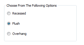
Option Group
The Option Group displays a list of options with radio buttons adjacent to each. Only one of the group of options can be selected.
When the form control is applied the name entered will display as the caption for the form control. This can be changed by selecting the Caption property.
When an item in the option group is selected the form control reports the exact item as it appears in the control.
Items are added to the control from the Items property. Use the pipe bar to separate each item, for example
= "Item A|Item B|Item C"
or
="1|2|3|4"
The rule builder has some functions and helpers that assist with entering values into the items property. This can be done by manually typing the items or by using Define Tables, see List, ListAll, ListAllConditional, ListAllConditionalDistinct and ListAllDistinct.
Properties
Appearance
Appearance - Border
Appearance - Caption
Appearance - Picture
- Picture
The default picture to be shown for this control.
- Picture (Selected)
The picture to display on the option when the option is selected.
- Picture Size Mode
Controls how the picture will be sized to the control.
- Picture Style
Controls how the picture will appear on the control.
Appearance - Text
Behavior
- Clear Selection Allowed
If TRUE, allows the user to clear the active selection, otherwise if FALSE, an item IS always
selected.
- Default Value
Controls the default value of the control. If the default value is based on a rule and the value
changes, then the value of the control will be changed to be the new default value.
- Enabled
Controls whether the control is enabled (if the result is TRUE) or disabled (if the result is
anything other than TRUE, e.g. FALSE).
- Error Result
Determines whether the value of the control is in error. The result of this rule is a string
containing the error message if the value is in error, otherwise a blank string or the number zero.
- Items
A list of items, delimited by the | symbol, which control the items shown in the control.
- Selected Item
The selected item in the list.
- Selected Item (Override Rule)
The selected item in the list.
- Selected Item Removed Behavior
Specifies the action taken by the list control when the list of items is changed, and the selected
item is not in the new list.
- Tab Index
Configures the position of the control in the form tab order.
- Visible
Determines whether the control is visible (TRUE) or hidden (FALSE).
Events
General
- (Metadata)
Optional text which can be used to provide information belonging to or about a control. For example,
a list of CSS classes which can be parsed and applied to the control using the Integration Theme in
DriveWorks Live. This doesn't affect the control's behavior.
- (Name)
The name of the control
- (Tag)
Optional text which can be used to describe the control, but which doesn't affect the control's
behavior.
- Tooltip Duration
Controls the duration, in seconds, for which the tooltip will remain visible. Values of 0 and below
indicate an infinite duration.
- Tooltip Text
Specifies the text to display in a tooltip when hovering over the control.
Layout
- Height
Controls the height of the control.
- Left
Controls the left position of the control.
- Top
Controls the top position of the control.
- Width
Controls the width of the control.
A user form control where one selection can be made from a group
of options.