Appearance - Base
Logo
Uploading a file here will replace the logo displayed on the top left of the website.
Uploaded images will be scaled to fit the space.
Cover Image
Uploading a file here will replace the image (grid) displayed on the right when on the Login page.
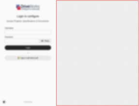
Uploaded images will be scaled to fill the space.
Body
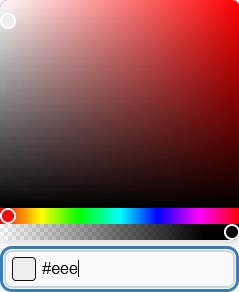
Background is the color of the main page background.
Text is the color of text displayed on the site.
Link is the color of links displayed on the site.
Link (Hover)is the color of links displayed on the site when hovered.
Content
Background is the color of the tiles displayed on the body background.
Background (Stacked) is the color of stacked tiles.
Border is the color of the border on the Color Scheme selector and login separator.
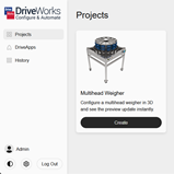
Navigation
Background is the color of the navigation pane.
Text is the color of the text of the navigation pane.
Navigation Items
Background is the color of the navigation elements on the navigation pane.
Background (Hover) is the hover color of the navigation elements on the navigation pane.
Background (Current) is the current/selected color of the navigation elements on the navigation pane.
Border is the border color of the navigation elements on the navigation pane.
Border (Hover) is the border hover color of the navigation elements on the navigation pane.
Border (Current) is the current/selected border color of the navigation elements on the navigation pane.
Text is the text color of the navigation elements on the navigation pane.
Text (Hover) is the text hover color of the navigation elements on the navigation pane.
Text (Current) is the current/selected text color of the navigation elements on the navigation pane.
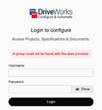
Login
Background is the color of the background of the login pane.
Text is the color of the text of the login pane.
Run
Background is the color of the page background behind the form.
Outline
Hover is the color of the border when a user hovers over a clickable element, eg. a project on the Projects page.
Focus is the color of the border when a user focusses on a clickable element, eg. a project on the Projects page.
Loading
Backdrop is the color of the overlay displayed on top of the content while it is loading.
Spinner (Primary) is the color of the larger spinner portion on the default loading state.
Spinner (Secondary) is the color of the smaller spinner portion on the default loading state.
Text is the color of the text displayed below the spinner on the default loading overlay.
 from the bottom of the