Date Picker
The Date Picker is a form control that allows a date to be selected from an interactive calendar.
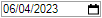
The Date Picker appears on a user form as in the image below:
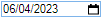
When the user hovers over the control the outline color will change as in the image below:
Once the Date Picker is selected the calendar will pop out from the control, as in the image below:
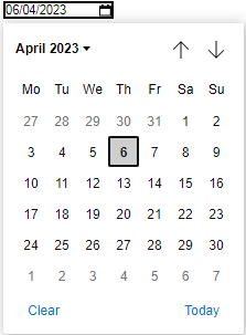
Once a date is selected from the calendar this will be the value of the control.
Properties
Appearance
Appearance - Border
Appearance - Caption
Appearance - Text
- Font
Specifies the font of the text shown in the control.
- Text Color
Specifies the color of the control's text.
- Text Color (Disabled)
Specifies the color of the control's text when the control is disabled.
- Text Color (Hover)
Specifies the color of the control's text when the control is in a hovered state.
- Text Horizontal Alignment
Controls whether the text is horizontally aligned to the left, right or center
Behavior
- Date
Specifies the selected date in the control.
- Date (Override Rule)
Specifies the selected date in the control.
- Date Format
How the date value for this control should be formatted.
- Default Value
Controls the default value of the control. If the default value is based on a rule and the value
changes, then the value of the control will be changed to be the new default value.
- Enabled
Controls whether the control is enabled (if the result is TRUE) or disabled (if the result is
anything other than TRUE, e.g. FALSE).
- Error Result
Determines whether the value of the control is in error. The result of this rule is a string
containing the error message if the value is in error, otherwise a blank string or the number zero.
- Hide On Date Selection
Specifies whether or not to hide the date picker pop- up when a date is selected.
- Maximum
The maximum value that can be selected on the control.
- Minimum
The minimum value that can be selected on the control.
- Tab Index
Configures the position of the control in the form tab order.
- Visible
Determines whether the control is visible (TRUE) or hidden (FALSE).
Events
General
- (Metadata)
Optional text which can be used to provide information belonging to or about a control. For example,
a list of CSS classes which can be parsed and applied to the control using the Integration Theme in
DriveWorks Live. This doesn't affect the control's behavior.
- (Name)
The name of the control
- (Tag)
Optional text which can be used to describe the control, but which doesn't affect the control's
behavior.
- Tooltip Duration
Controls the duration, in seconds, for which the tooltip will remain visible. Values of 0 and below
indicate an infinite duration.
- Tooltip Text
Specifies the text to display in a tooltip when hovering over the control.
Layout
- Caption Width
Controls the width of the control's caption.
- Height
Controls the height of the control.
- Left
Controls the left position of the control.
- Top
Controls the top position of the control.
- Width
Controls the width of the control.