How To: Create Appealing DriveWorks 3D files
These tips will help you create better looking DriveWorks 3D files.
Environment
Ambient Light
- Keep light level low, this is the minimum light level for your scene. Default is set far too high so you may forget to add lights.
- Keep color gray-scale or very slight tints towards general daylight colors (slight blue for daytime, orange for sunset etc)
- If you're using Image Based Ambient lighting, you'll want this value to be higher, doubling the intensity would be a good starting point
Environment Map
- Use Environment Map must be set to true to use any of these features
- Just enabling it will allow reflections of the skybox on your model (even if you don't enable the skybox). The reflection strength is affected by the material Reflectivity property.
- Image based ambient tints the ambient light by the skybox color, this gives a more realistic base lighting, especially when you're using a skybox.
- If you use this, remember to increase the ambient intensity a bit.
- This will tint your model a bit to the color of the skybox which might be what you want, but you can undo this by tinting the ambient by the opposite color. (Yellow-Orange).
- Display Skybox will show the skybox instead of the background color (when TRUE). If this is enabled, background color is irrelevant.
Background Color
- Document background is different than on the control as it's the rendered background color. If this is opaque it will obviously effectively override the control's background color.
- If you're setting this to transparent, make sure the rest of the color is black or it will still tint transparent objects (unless that's intended).
- Using an opaque value here is better as it will allow the Anti-Aliasing to do a better job, and transparent objects' colors will be more correct.
- Try to avoid semi-transparent colors especially if you have transparent objects in the scene.
| Standard ambient lighting | Image based ambient lighting | Image based ambient with color correction |
|---|---|---|
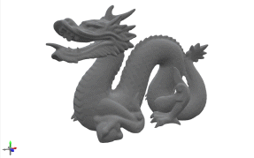 | 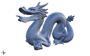 | 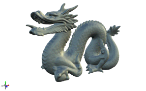 |
Scene Composition
General Tips
- Look for good real-world references of interior design depending on the project.
- Try to add more than just the model you're configuring, Add a small surrounding scene.
- At the very least add a floor, and make sure it's big enough that you can see the full effects of any lights you're using. You can apply a texture to make it fade off at the edges.
- You can add simple shadowing by using a texture of semi-opaque black on a model (cube/plane) placed just above the ground.
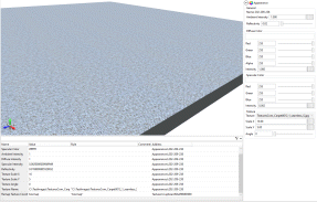
- Be careful with borders between materials. It doesn't look good when texture meets texture. Edges should be more defined/bordered; for example if you have a room, don't have your carpet meet the wallpaper. Make sure you add a skirting board to break it up.
- Avoid transparent objects as much as possible.
- If you have to use transparent objects, split the parts as much as possible and don't put transparent objects within transparent objects ever.
- Also avoid self-occluding transparent objects where possible.
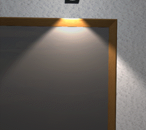
- Try to have a 3D modelled light-source for point lights and spot lights.
| Transparent self-occlusion: |
|---|
Lighting
Directional Lights
- Takes the rotation of the node it's placed on. Position is irrelevant.
- Light affects the entire scene from the same direction at the same intensity.
- Generally used to simulate the sun.
Point Lights
- Light affects surrounding objects in all directions from the position of it's parent node. Rotation is irrelevant.
- Light intensity falls off over distance, how quickly it falls off depends on the Falloff Exponent. Real-world is 2, a decent value to use though is about 1.5.
- Reduce this value when you want the light to affect more of the scene more evenly.
- Increase this value when you want a very local light.
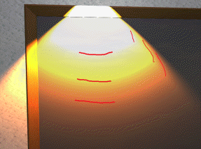
Spot Lights
- Light affects objects in a cone from the position of the node. The center of the cone is the node's Z direction (blue triad arrow). Therefore both position and rotation are important.
- Light intensity and falloff are exactly the same as a point light, just constrained to a cone.
- The cone is controlled by the falloff start and end angle properties.
- The light is at full brightness from straight forward, to the falloff start angle. The light then falls off from 100% to 0% between the start and end angle.
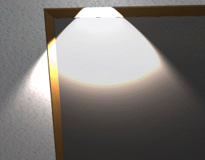
- The bigger the difference between start and end, the softer the edge of the spotlight. If you want a hard edge have the values just off equal, this is free anti-aliasing for the light.
General Lighting Tips
- Make lighting "moody". You want to have dramatic contrast between light and dark areas. Spot lights are great for this.
- Final colors max out at 1, this is calculated based on all affecting lights and the appearance's color.
- This can sometimes be intended and simulates overexposure on a camera when used carefully. (Eg. inside light fittings)
- Hitting the limit can make your colors seem off as R/G/B can hit the limit at different times.
- This can create harsh edges where the lighting gradient just stops.
- If it happens, you can adjust light intensity and falloff. Lowering intensity AND falloff together will make lights dimmer at short distance while staying bright at longer distances.
- If you can't avoid it, textures can help make the harsh line less obvious.
- Use a directional light to give your scene a base light level, but don't set this too bright or you won't notice your other lights.
- You can add a much dimmer "up light" to simulate sunlight bouncing off the ground, color this to match your floor.
- When you use a spot light, add a dim point light too, this simulates light leaking from a fixture.
- When using strip lights, use multiple lights along the length of the light fixture.
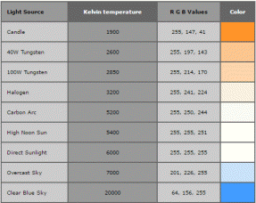
- Use colors according to the light-source. There are values easily found online for values like daylight, incandescent bulbs, LED lights, street lights etc.
- There are limits to the number of lights affecting each object. Only the brightest lights are used per object, this takes into account distance to a point/spot light so generally you shouldn't have to worry. (5 directional, 3 point and 3 spot)
- You can still use the control's lighting presets for base lighting. These use 1-5 directional lights.
- 3-Point-Lighting is nice using point lights.
- Use a white directional, and a blue tinted and orange tinted point lights sat in front and behind the model.
- This highlights the contours of the model using the color contrast from the different lights.
- Don't use a light to try and light up an actual light emitter like a bulb. Just increase the ambient/diffuse intensity on its appearance.
| Maxed out lighting | Split RGB colors | Corrected lighting |
|---|---|---|
 |  |  |
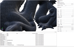
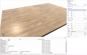
Appearances
Appearance Properties
- Diffuse Color
- Base color, determines the color of diffused light.
- Alpha can be used for transparent objects. For things like glass this should be set very low.
- This color is multiplied with the light color.
- This means black will always be black no matter how many lights you shine at it. As will a red light shining at a blue diffuse color.
- Specular Color
- Color of the specular highlight that simulates directly reflected light.
- This should pretty much always be white for organic materials.
- For metallic materials use the same color as the diffuse color.
- Like diffuse this is multiplied with the light color.
- Ambient Intensity
- Multiplier for intensity of ambient light on this appearance.
- Use this to make objects look like they're glowing. Light bulbs etc.
- Reduce for transparent objects.
- Diffuse Intensity
- Multiplier for intensity of diffuse light on this appearance.
- For transparent objects reduce this to near 0.
- Mostly avoid using this outside of transparent objects.
- Specular Intensity
- Multiplier for intensity of the specular highlight on this appearance.
- Turn this up to make something look shiny.
- Simulates how much light get's reflected by a surface.
- Reflectivity
- Affects strength of environment map, the higher this is the clearer/brighter the environment map will be.
- Makes specular highlight spots smaller.
- Generally makes specular highlights dimmer, so turn up spec intensity as you turn this up.
- Turn this up to make things look glossy or wet.
- Texture Scale X/Y
- Affects the size of the texture, horizontally or vertically.
- Higher numbers make the texture look smaller.
- Numbers > 1 will make the texture look bigger.
- Numbers > 0 will flip the image.
- Eg. Setting this to 2 will make the texture repeat twice. Setting to 0.5 will only show half the image.
- Texture Angle
- Rotates the texture around the top-left corner.
- Texture Name
- Path to the texture to set on the appearance.
General Tips
- Use textures for pretty much everything, nothing in real life is a solid color.
- Use the Texture coordinate remapping as much as possible.
- Use separate appearances and swap between them rather than changing appearance properties via rules (sometimes necessary).
- For all colors. Never have a pure color like (0,0,0)black or (0,1,0)Green. Do black as like (0.02,0.02,0.02) and the green as (0.1,1.0,0.05) for example.
- Specular highlights are reflections from dir/point/spot lights. If you don't add any you won't see any.
- Reflectivity dims the specular highlights while making the spots smaller.
- For most materials, reflectivity should be > 1. For something mega shiny, > 20 but for transparents you want nearly all the color from the environment map. so go up to 20-30.
- If you scale a model and want your texture to stay the same size (texels per meter) apply the exact same scale.
- We wouldn't recommend using negative texture scales, instead just flip your image.
- Using texture angle can add seams to your textures so try not to use it unless you have a good seamless/repeating texture or stick to 90/180/270 degrees.
- Use appropriately sized textures. No point having to download pixels you'll never see.
- You can estimate size on screen to determine what's appropriate, if you have a preview control that's 1000x1000 pixels you will not need 1024*1024 images.
- Huge textures actually look worse in WebGL as there is no mip-mapping (this causes a speckled effect to occur as you move the camera, as the chosen texel from that texture at that pixel jumps 4-5 texels across the image at a time from one frame to the next. Blurring the image (reducing size) stops this effect.
Example Appearances
| Material | Details | Example |
|---|---|---|
| Stone |
|  |
| Wood Floor |
|  |
| Leather |
| 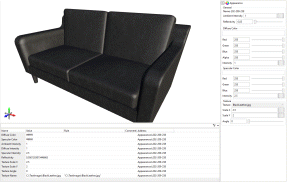 |
| Gold |
| 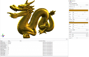 |
| Tiles |
| 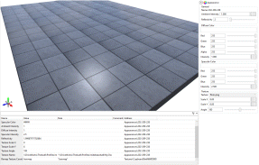 |
| Carpet |
|  |
| Glass |
|  |
Resources and Tools
- http://www.textures.com/
- Search for the material you want, and look for "seamless" textures. These look good repeated.
- If a texture you've selected has multiple bits to it. (like albedo, diffuse, specular, normal etc) The one you want is 'diffuse'. Sometimes you can use an 'albedo' texture.
- Use Gimp or Photoshop to edit textures.
- You don't need any experience to edit the brightness/contrast/saturation/hue, or flip/mirror/resize the image. All quick to do and make a big difference.
- Light values (just divide by 255).
| Knowledge Base Article Ref: | KB17022801 |
|---|
- Welcome
- What's New
- DriveWorks 23
- Older Versions
- DriveWorks 22
- DriveWorks 21
- DriveWorks 20
- DriveWorks 19
- DriveWorks 18
- DriveWorks 17
- DriveWorks 16
- DriveWorks 15
- DriveWorks 14
- DriveWorks 12
- What's New DriveWorks 12
- Form Design
- Rule Builder
- Tables
- Documents
- Model Rules
- Specification Test Mode
- Specification Explorer
- 3D Preview
- DriveWorks Live
- DriveWorks Add-in for SOLIDWORKS
- DriveWorks 11
- What's New DriveWorks 11
- DriveWorks Administrator
- DriveWorks Add-in for SolidWorks
- DriveWorks Package
- Settings
- Clear Recent List
- Task Status
- Renaming Controls and Variables
- Rule Builder
- Group Tables
- Form Design
- Documents
- Model Rules
- Specification Macros
- Toolbox
- DriveWorks Autopilot
- DriveWorks Live
- DriveWorks 3D Workshop
- DriveWorks Pro Server
- Installation
- Licensing
- DriveWorks 10
- DriveWorks 9
- DriveWorks 8
- Installation
- DriveWorks Administrator
- DriveWorks Data Management Tool
- DriveWorks Live
- Administrator
- DriveWorks Administrator
- Before You Begin
- Using DriveWorks Administrator
- Using DriveWorks Administrator
- SolidWorks
- SOLIDWORKS
- Captured Models
- Part Mode
- Assembly Mode
- Drawing Mode
- Model Generation
- New Specification
- Project Designer
- Project Designer
- Stage 1: Group Setup
- Stage 2: User Interface
- Form Navigation
- CPQ-CustomItem Template
- Form Design
- Form Design
- 3D Preview Box
- Check Box
- Check Box Group
- Child Specification List
- Clipboard Button
- Combo Box
- Data Grid
- Data Table
- Date Picker
- Dialog Button
- Frame Control
- Hyperlink
- Item List
- Label
- List Box
- Macro Button
- Measurement Text Box
- Numeric Text Box
- Option Button
- Option Group
- Picture Box
- Slider
- Specification Host
- Spin Button
- Text Box
- TinyMCE Control
- Toggle Switch
- Upload Control
- Web Frame
- Form Messages
- Stage 3: Data and Rules
- Stage 4: Output Rules
- Documents - Files
- Documents - Data
- Documents - 3D
- DriveWorks 3D File
- Rotation And Orientation
- Environment
- Assets
- Nodes
- Guides and Best Practices
- Model Rules
- Generation Tasks
- Generation Tasks
- Generation Task Toolbox
- General
- Assembly
- Assembly & Drawing
- Drawing
- Activate Sheet
- Auto Arrange Dimensions
- Auto Balloon View
- Create General Table
- Create Sheet Images
- Delete Dangling Dimensions
- Drive General Table
- Re-jog Ordinate Dimensions
- Replace View Component Reference
- Rescale And Position View
- Set Annotation Position by Percentage
- Set Annotation Position by Distance
- Set Annotation Positions by Percentage
- Set Annotation Positions by Distance
- Setting: Hide Dangling Dimensions
- Set View Relative Position
- File System
- Part
- Part & Assembly
- PDMPro
- Specification
- Generation Tasks - Condition Editor
- Generation Task Condition Toolbox
- Specification Conditions
- Generation Conditions
- Stage 5: Specification Control
- Specification Settings
- Specification Properties
- Specification Macros
- Specification Flow
- Toolbox
- Toolbox
- Tasks
- 3D
- Calculate Bounding Box Data
- Calculate Estimated Volume Data
- Create Preview Image
- Delete Document Node
- Duplicate Document Node
- Export 3D as gITF
- Export 3D as OBJ
- Export 3D as STL
- Export Smoothed 3D
- Import 3D Document
- Get Document Node Transform
- Get LookAt Rotation
- Import glTF as 3D
- Import OBJ as 3D
- Import STL as 3D
- Run 3D Preview
- Save 3D Document
- Set Document Entity Suppression State
- Set Document Node Static Transform
- Suffix 3D Asset Names
- XR Session Exit
- Autopilot
- Data
- Clear Deferred Flag For Drawings
- Clear Deferred Flag For Specification Drawings
- Create Project Metadata
- Delete Calculation Table Rows
- Delete Group Table Rows
- Delete Simple Table Rows
- Drive Constant Value
- Drive Control Value
- Enable OnDemand
- Evaluate Rule Value
- Get Constant Value
- Get Control Value
- Refresh Tables
- Regenerate and Delete Component
- Regenerate and Delete Specification Components
- Regenerate and Overwrite Component
- Regenerate and Overwrite Specification Components
- Release Documents
- Release Emails
- Release Models
- Send HTTP Request
- Set Project Meta Data Value
- Set Triggered Action States To Trigger On
- Update Group Table Using Array
- File System
- General
- PDF
- PDF: Add Page Stamps
- PDF: Add Watermark Image
- PDF: Add Watermark Image With Autofill
- PDF: Add Watermark Text
- PDF: Add Watermark Text With Autofill
- PDF: Image(s) to PDF
- PDF: Markdown File to PDF
- PDF: Merge
- PDF: PDF to Image(s)
- PDF: Remove Document Info
- PDF: Remove Metadata
- PDF: Remove Page Stamps
- PDF: Remove PDF Pages
- PDF: Replace Keyword
- PDF: Rotate Page(s)
- PDF: Set Document Info
- PDF: Set Metadata
- PDF: Split
- PDMPro
- PDMPro: Check in File
- PDMPro: Check In Folder Content
- PDMPro: Check Out File
- PDMPro: Check Out Folder Content
- PDMPro: Create Folder
- PDM Pro: Delete a file from vault
- PDMPro: Delete Folder
- PDMPro: Get Latest File
- PDMPro: Get Latest Files
- PDMPro: Get Latest Files In Folder
- PDMPro: Get Multiple Serial Numbers
- PDMPro: Get Next Serial Number
- PDMPro: Get Specific File Version
- PDMPro: Update File Data Card
- PDM Pro Update Folder Data Card
- Security
- Add New Team
- Add New User
- Add User To Team
- Delete Team
- Delete User
- Enable/ Disable User
- Remove User From Team
- Set All Teams Can Run DriveApp
- Switch Team Leader Status
- Update Team Display Name
- Update Team Members Can Capture
- Update Team Members Can Edit All Specifications
- Update Team Members Can Edit DriveApps
- Update Team Members Can Edit Group Security
- Update the Team/Project Permissions
- Update User Display Name
- Update User Email Address
- Update User Password
- Services
- Specification Hosting
- Specifications
- Archive Specification
- Cancel Specification
- Change Child Specification State
- Complete Child Specification
- Copy Closed Child Specification
- Copy Closed Specification
- Copy Specification
- Create Closed Child Specification
- Delete Specification
- Export Specification Data
- Increment Revision Number
- Invoke Child Specification Operation
- Invoke Child Specification Transition
- Invoke Operation on Existing Specification
- Invoke Specification Operation
- Invoke Specification Transition
- Invoke Transition on Existing Specification
- Set Specification Owner
- Start Child Specification
- Store Specification
- Conditions
- Stage 6: Specification
- Specification Explorer
- Personal Web Edition
- Stage 7: DriveApps
- DriveApps
- Dashboard DriveApp
- CPQ DriveApp
- Scheduler DriveApp
- Settings
- Rules Builder
- Rules Builder
- Extract Variable
- Edit Variable
- Rule Builder Settings
- Writing Rules
- Writing rules
- Document Rules
- Model Rules
- Parts and Assemblies
- Model Rules Overview
- Model Rules
- Advanced Feature Parameter Rules
- Model Rules Advanced Feature Parameter Rules - Overview
- Boss/Base Features
- Boss/Base Thin
- Break Corner
- Chamfer
- Circular Component Pattern
- Circular Pattern
- Coordinate System
- Cosmetic Thread Features
- Curve
- Curve Driven Pattern
- Curve Through XYZ Points
- Cut Features
- Distance Mate Features
- Draft
- Edge Flange
- Features
- Fillet
- Hole Wizard Features
- Linear Component Pattern
- Linear Pattern
- Lofted Bend
- Mates
- Mold Features
- Offset Surface
- Pattern Driven Component Pattern (Derived)
- Patterns with Advanced Feature Parameters
- Revolved Boss/Base
- Revolved Boss/Base Thin
- Rib
- Ruled Surface
- Sheet Metal Features
- Simple Hole
- Sketch Driven Pattern
- Slot Mate
- Surface Features
- Sweep Thread
- Table Driven Pattern
- Var Fillet
- Weldment Features
- Wrap
- Drawings
- Functions
- Functions
- 3D
- Conversion
- Cryptography
- Database
- Date and Time
- File System
- Group
- Helper
- Lambda
- List
- Logical
- Math
- Security
- PDF
- PDMPro Plugin
- Polygon
- Specification
- Table
- CountIF
- CSVFromTable
- Dcount
- DMax
- DMin
- DWHLookup
- DWVLookup
- GetData
- GetTableValue
- HLookup
- ListAll
- ListAllConditional
- ListAllConditionalDistinct
- ListAllDistinct
- SumTableColumn
- TableAppendColumns
- TableAppendRow
- TableAppendRows
- TableAverage
- TableBreak
- TableColumn
- TableColumnLookup
- TableCombine
- TableDistinct
- TableDistinctCount
- TableDistinctSum
- TableFilter
- TableFilterAll
- TableFilterByList
- TableFormat
- TableFromCsv
- TableFromList
- TableGetColumnCount
- TableGetColumnIndexByName
- TableGetDataRows
- TableGetHeaderRow
- TableGetRowCount
- TableGetRows
- TableGetValue
- TableJoin
- TableMax
- TableMaxValue
- TableMin
- TableMinValue
- TableRemoveBlankColumns
- TableRemoveBlankRows
- TableRemoveColumn
- TableRemoveRow
- TableReplaceHeaderRow
- TableReplaceHeaders
- TableReplaceRow
- TableReverse
- TableRow
- TableSearch
- TableSelectColumns
- TableSequence
- TableSkipRows
- TableSort
- TableSortByDate
- TableSortByList
- TableSubstitute
- TableSum
- TableTakeRows
- TableTranspose
- TableWithSequence
- VLookup
- Text
- Validation
- Variables
- Vector
- Group Wizards
- Project Wizards
- 3D Viewer
- User
- DriveWorks User
- Before You Begin
- Using DriveWorks User
- With SOLIDWORKS
- Task Explorer
- Stage 1: Specification
- Stage 2: DriveApps
- Settings
- Group Wizard
- Autopilot
- DriveWorks Autopilot
- Before You Begin
- Using DriveWorks Autopilot
- Task Explorer
- Autopilot
- Model Explorer
- Connectors
- Stage 1: Specification
- Stage 2: DriveApps
- Settings
- Group Wizard
- Import Specifications
- Live
- DriveWorks Live
- Before You Begin
- Using DriveWorks Live
- Stage 1: Specification
- Stage 2: DriveApps
- Stage 3: IIS
- Settings
- Group Wizard
- Customizing DriveWorks Live
- Customizing DriveWorks Live
- Integration Theme
- Web Theme
- Application Theme
- Pro Server
- Pro Server
- Before You Begin
- Pro Server Management Console
- Pro Server Web Application
- DriveWorks CPQ
- Tools
- DriveWorks Package
- Data Management
- Data Management
- Prerequisites
- Settings
- Settings
- Plugin Settings
- Data Management Task Explorer
- Group Upscale
- License Management
- Knowledge Base
- Knowledge Base
- Guides and Best Practices
- DriveWorks Guides
- How To: Automatically Launch a Dashboard Tile (KB23012601)
- How To: Configure Microsoft Entra ID For Exchange Online Email Authentication (KB26011301)
- How To: Deploy DriveWorks Pro (KB13010804)
- How To: DriveWorks Best Practices (KB12121019)
- How To: Implementation Guide (KB12121022)
- How To: Microsoft Azure (KB19020401)
- How To: Move From a 32bit machine to a 64bit machine (KB13103013)
- How To: Take An Implementation From Development To Production
- SOLIDWORKS Best Practices
- How To: Improve Model Generation Performance (KB22051001)
- SOLIDWORKS Best Practices (KB13103019)
- Equations (KB13103020)
- Configuration Specific Properties (KB13103021)
- Design Tables, Configurations and Derived Configurations (KB13103022)
- In Context or Top Down Modelling (KB13103024)
- Mirror Components (KB13103025)
- Patterns (KB13103026)
- Piping (KB17101301)
- Read Only Models (KB13103027)
- Virtual Parts (KB13103028)
- DriveWorks Live and IIS
- How To: Create and Edit Specifications Using URL Parameters (KB25042201)
- How To: Embed DriveWorks In WordPress (KB23012301)
- How To: Install Internet Information Services (IIS) (KB20111201)
- IIS Management
- How To: Configure IIS For The Web Theme (KB13103033)
- How To: Configure IIS For The Integration Theme (KB20111101)
- How To: Load Balance IIS (KB20111601)
- How To: Troubleshoot IIS (KB16081601)
- How To Articles
- DriveWorks Data, Groups and External Databases
- How To: Backup a SQL Server Database (KB13022701)
- How To: Restore a SQL Server Database (KB13010806)
- How To: Move a Shared Group (KB13010805)
- How To: Backup an Individual or Shared Group and Data (KB13022601)
- How To: Move an Individual Group (KB12121028)
- How To: Delete a Group (KB13103007)
- How To: Reduce the Size of a Group (KB19012301)
- How To: Rename A Group (KB17092601)
- How To: Move DriveWorks Data (KB12121029)
- How To: Rename A Project (KB12121032)
- How To: Configure SQL Server for Remote Access (KB14022401)
- How To: Configure Windows Firewall for Pro Server (KB25031101)
- How To: Configure Windows Firewall for SQL Server (KB13103002)
- How To: Write Database Queries Using SQL (KB12121044)
- How To: Optimize A SQL Database (KB17071701)
- How To: Set up a DSN-Access (KB13103016)
- How To: Set up a DSN-SQL Server (KB13103018)
- How To: Setup a DSN-Other Database (KB13103017)
- How To: Configure SQL Server 2008 for Remote Access (KB13010801)
- How To: Configure SQL Server 2005 for Remote Access (KB13010802)
- How To: Configure Windows Firewall for SQL Server - Windows XP and Vista (KB13103003)
- How To: Copy a DriveWorks 6 Group in SQL Server (KB13010803)
- How To: Copy a DriveWorks 6 Implementation (KB12121003)
- DriveWorks Live
- How To: Automatically Start DriveWorks Live (KB13103034)
- How to: Calculate the RAM required for a Server to host DriveWorks Live
- How To: Change the Favicon in DriveWorks Live (KB18081401)
- How To: Change the Loading Gif in DriveWorks Live (KB18081402)
- How To: Customize a DriveWorks Live Form using CSS
- How To: Customize the DriveWorks Live Web Theme (KB13120601)
- How To: Embed Non-Standard Fonts (KB16051701)
- How To: Ensure A DriveWorks Live Form is responsive when rendered in a CSS grid
- How To: Extend the Timeout In DriveWorks Live (KB12121020)
- How To: Implement an Auto-Login in DriveWorks Live (KB13103012)
- How To: Make Your Website React To Specification Events With The Integration Theme (KB19042301)
- How To: Modify the Update Interval In DriveWorks Live (KB12121027)
- How To: Pass Data from a Website to a Specification within an IFrame (KB18111901)
- How To: Upgrade The Integration Theme (KB24011601)
- How To: Upgrade the Web Theme (KB14022801)
- DriveWorks 3D
- DriveWorks Autopilot
- Data and Rules
- Documents
- Installation and Licensing
- How To: Determine the Version of DriveWorks Pro (KB12121009)
- Installation
- How To: Install DriveWorks From A Command Prompt (KB16071802)
- Info: Identify License Activation Codes (KB13022602)
- How To: License DriveWorks Live Using Environment Variables (KB19051401)
- How To: Manually Install A PowerPack (KB18102201)
- Security and Specification
- Templates
- User Form
- How To: Apply Line Item Numbers To Child Specifications (KB13120301)
- How To: Change A Static Property To A Dynamic Property (KB13111201)
- How To: Correctly Format Text (KB13021901)
- How To: Create A Clickable Image (KB12121007)
- How To: Create In Form Navigation (KB13120302)
- How To: Reference Control Properties (KB16010601)
- How To: Use The Macro Argument Property (KB12121043)
- How To: Specify Multiple Projects Into One Main Project using the Child Specification List control (KB12121034)
- How To: Use the Specification Host control (KB16122101)
- SOLIDWORKS and PDM
- How To: Create Multiple Component Sets From A Single Specification
- How To: Create Models To Be Used As Replacement Files (KB14050801)
- How To: Drive the Color of a Part (KB12121016)
- How To: Drive the Material of a Part (KB12121017)
- How To: Drive the Texture of a Part (KB13103010)
- How To: Drive Sheet Metal Parts (KB12121018)
- How To: Generate A Drawing That References Multiple Files (KB17092701)
- How To: Name And Write Rules For Mating To A Face, Plane, Axis or Coordinate System (KB17072701)
- How To: Replace a Component With a Static or Driven Replacement Model (KB13103014)
- How To: Replace An Instance With A Driven Replacement Model (KB12121033)
- How To: Create A Macro To Run On A SOLIDWORKS File (KB13103006)
- How To: Maintain Rules For An Existing Model When It Becomes A Child Of A Parent Assembly (KB12121026)
- How To: Rename A Master Model (KB18011801)
- Info: Dangling Dimensions (KB13022001)
- Info: Instant3D (KB13022102)
- Info: Mirrored Components (KB12121005)
- Info: Model Generation Behavior (KB12121006)
- Info: SOLIDWORKS Document Manager (KB12121011)
- Info: SOLIDWORKS System Options (KB12121012)
- How To: Set Up SOLIDWORKS PDM
- Diagnostics, Reporting and Troubleshooting
- Diagnostics And Reporting
- Diagnostics
- How To: Diagnose Project and Generation Issues (KB12121010)
- How To: Diagnose Project Issues Using The Rules Builder (KB12121013)
- How To: Diagnose Project Issues Using Specification Test Mode (KB13103009)
- How To: Diagnose Project Issues Using SOLIDWORKS (KB12121014)
- How To: Diagnose Project Issues Using The Form Designer (KB12121012)
- Reporting
- Troubleshooting
- Error Message Search
- How To: Create A Cut Down Project (KB17092602)
- How To: Troubleshoot 3D Preview (KB16113001)
- How To: Troubleshoot Documents (KB13022702)
- How To: Troubleshoot DriveWorks Autopilot
- How To: Troubleshoot DriveWorks Group Issues (KB12121037)
- How To: Troubleshoot DriveWorks Live (KB14021401)
- How To: Troubleshoot DriveWorks Pro Server Connection (KB13103030)
- How To: Troubleshoot Emails (KB12121038)
- How To: Troubleshoot Form Designer (KB12121035)
- How To: Troubleshoot Floating Licenses (KB20112701)
- How To: Troubleshoot IIS (KB16081601)
- How To: Troubleshoot Installation (KB13103029)
- How To: Troubleshoot The Integration Theme (KB21060901)
- How To: Troubleshoot Fixed Licenses (KB13010807)
- How To: Troubleshoot Missing Plugin References KB17101001
- How To: Troubleshoot SOLIDWORKS Errors
- How To: Troubleshoot SOLIDWORKS PDM
- How To: Troubleshoot SQL Connection (KB13103032)
- How To: Troubleshoot Triggered Actions
- How To: Troubleshoot WebView2 Runtime Installation (KB25102401)
- Information Articles
- DriveWorks 3D
- External Data
- External Resources
- File and Template Locations
- Info: DriveWorks File Extensions (KB13022602)
- Info: File and Template Locations (KB13103001)
- Template Files
- Lists and Preferences
- DriveWorks Autopilot Files
- DriveWorks Live Theme Files
- Reporting
- Help File
- File Naming and Location
- Form Control Properties
- Concept: Use of the Override Rule (KB12121001)
- Allow Copy
- Allow Printing
- Behavior
- Border Radius
- Border Style
- Border Width
- Button and Caption Width
- Button Padding
- Button Layout
- Button Spacing
- Button Text Reset Duration
- Button Icon Style
- Camera Auto-Center
- Camera Default Orientation
- Camera Enable Orthographic
- Camera Enable Pan
- Camera Pan Max Radius
- Camera Rotation Limits
- Camera Zoom Limits
- Caption, Text (Appearance Property)
- Horizontal Alignment
- Character Limit
- Check Alignment, Option Alignment
- Checked
- Check Size, Radio Size, Button Icon Size, Toggle Size
- Clear Selection Allowed
- Click Selected Row To Deselect
- Color
- Column Widths
- Date
- Date Format
- Decimal Places
- Default File Name
- Default Row Identity
- Default Row Index
- Default Value
- Dialog Name
- Display Performance Window
- Display Units
- Display Value
- Duplicate File Behavior
- Editor Mode
- Enable Animations
- Enabled
- Enable Hover
- Enable Image Mode
- Enable Upload
- Enable VR
- Enter Immersive XR Button File Name
- Enter Inline XR Button File Name
- Error Result
- File Filter, Upload File Extension Filter
- File Name
- File Size Limit, Byte Limit, Upload File Size Limit
- Final Frame Render
- Font
- Form Name
- Generation Method
- Group Name
- Height
- Hidden Fields
- Hidden Item Values
- Hidden Result Columns
- Hide Characters
- Hide On Date Selection
- Header Text Horizontal Alignment
- Header Text Vertical Alignment
- Horizontal and Vertical Scroll Visibility
- Text Underline, Text Underline (Hover)
- Hyperlink
- Identity Fields
- Increment
- Input Values
- Inset Track
- Items
- Items (Data Table)
- Item List Editor
- Language Pack Path
- Left
- Lighting
- Link Behavior
- Loading Progress Display
- Loading Progress Image File Name
- Macro Argument
- Macro Name
- Maximum
- (Metadata)
- Minimum
- Multiline
- Name
- Name, State and Type Column Visible
- Native Units
- Number Of Rows
- On Autopilot Preview Requested Macro
- On Background Clicked Macro
- On Cancelled Macro Name
- On Change
- On Preview Complete Macro
- On Transitioned Macro Name
- On Model Clicked Macro
- On Upload Complete Macro
- Opacity (Disabled)
- Orientation
- Override Rule
- Padding, Input Padding, Unit Padding
- Picture
- Picture Border Radius
- Picture Checked, Hover, Selected and Pressed
- Picture Height
- Picture Position
- Picture Size Mode, Size Mode
- Picture Style
- Picture Width
- Placeholder Text
- Preview Document Name
- Preview Engine
- Projects
- Read Only
- Reverse Direction
- Row Background Colors
- Row, Header Height
- Row Text Horizontal Alignments
- Row Text Vertical Alignment
- Selected Item and Selected Option
- Selected Item Removed Behavior
- Selected Row Index
- Show Border
- Show Check and Show Option
- Show Filler Column
- Show Grid Lines
- Show Limits
- Show Toggle Indicators
- Size Mode
- Input Spacing
- Sort Allowed
- Tab Index
- Tag
- Tags
- Target Control Name
- Task List Enabled
- HTML, Text, Value
- Text (Label Control)
- Text Horizontal Alignment, Option Text Horizontal Alignment, Toggle Alignment
- Text, Vertical Alignment
- Thumb Height
- Thumb Image
- Thumb Image Size Mode
- Thumb Margin
- Thumb Padding
- Thumb Width
- Timeout
- Tooltip Duration
- Tooltip Text
- Top
- Track Color
- Track Color (Fill)
- Track Fill Start Value
- Track Size
- Upload Directory Path
- Upload Disabled Message
- URL/HTML
- Use Relative Path Rules
- Use SOLIDWORKS Extension Suffix
- Visible
- Width
- Word Wrap
- Licensing
- Limits
- SOLIDWORKS
- Special Variables
- Specification Flow
- Support and Notices
- Info: Error Value and Error String (KB23071901)
- Info: Known Issues (KB13103005)
- Info: Legal Notices
- Info: Microsoft .NET September 2022 Update Crash (KB22101401)
- Info: Supported DriveWorks Versions (KB13103006)
- Info: Third Party Software Information And Downloads (KB12121013)
- Info: Web Theme And Application Theme For DriveWorks 21 (KB23080101)
- Info: Microsoft Windows Support (KB13010803)
- How To: Obtain The DriveWorks SDK (KB12121030)
- Info: Excel Projects and DriveWorks Projects (KB12121001)
- User Interface Customization and Shortcuts
- DriveWorks Labs
- DriveWorks Labs
- Downloadable PowerPacks
- CAMWorks PowerPack
- DriveWorks PowerPack for Microsoft Azure
- DriveWorks PowerPack for Microsoft Azure
- Functions
- Specification Tasks
- Image PowerPack
- Image PowerPack
- Functions
- Specification Tasks
- Add Transparent Padding To An Image
- Circular Crop Image
- Convert Color In Image To Be Transparent
- Convert Image To Greyscale
- Crop An Image By Removing Whitespace Or Transparency
- Draw A Polygon In A New Image
- Draw Lines In New Image
- Flip Image
- Generate Area Chart
- Generate Barcode
- Generate Column Chart
- Generate Line Chart
- Generate Pie Chart
- Rectangular Crop Image
- Remove Exif Orientation Data And Rotate If Necessary
- Resize Image
- Rotate Image
- Salesforce PowerPack
- Salesforce PowerPack
- Functions
- SFConnectionStatus
- SFCurrentlyLoggedIn
- SFGetAccountDetailByID
- SFGetAccountDetailByIDForSpecificFields
- SFGetAccountDetailByName
- SFGetAccountDetailByNameForSpecificFields
- SFGetAccounts
- SFGetAllAccountsWithDetail
- SFGetAllContactDetailForAccountByID
- SFGetAllContactDetailForAccountByname
- SFGetContactNamesForAccountByID
- SFGetContactNamesForAccountByName
- SFGetObjectData
- SFGetObjectFieldData
- SFGetObjectList
- SFGetPicklist
- Specification Tasks
- Create A New Account In Salesforce
- Create A New Attachment In SalesForce
- Create A New Contact In Salesforce
- Create a New Entry in Salesforce for a Named Entity
- Create A New Opportunity In Salesforce
- Create a New Opportunity Line Item in Salesforce
- Create A New Price Book Entry In SalesForce
- Create A New Product In SalesForce
- Create a New Quote in Salesforce
- Delete a Record in Salesforce
- Update An Entry In Salesforce For A Named Entity
- SOLIDWORKS CAM PowerPack
- Specification PowerPack
- Specification PowerPack
- Functions
- SppAddNumberColumn
- SppAppendValueToConstant
- SppArithmeticSequence
- SppASCII
- SppBase64EncodeUrlSafe
- SppCompareListsForDifferences
- SppCompareListsForMatches
- SppConvertJsonToTable
- SppConvertNumberCulture
- SppConvertNumberCultureInTable
- SppConvertTableToHTMLTable
- SppConvertTableToJson
- SppConvertTabletoXml
- SppConvertXmltoTable
- SppCountTextLines
- SppCreateAcronym
- SppCreateJwtUsingRS256
- SppDateTimeSpan
- SppDEC2HEX
- SppDecodeBase64String
- SppDecodeHexString
- SppFileInfo
- SppFilterTableByExclusionList
- SppFilterTableByInclusionList
- SppFindAndReplaceInTable
- SppFirstFormName
- SppFontWidthInMillimetres
- SppFontWidthInPixels
- SppFormatColumnInTable
- SppGetAllTeams
- SppGetAllUsers
- SppGetAutopilotLog
- SppGetAutopilotsInGroup
- SppGetCapturedComponents
- SppGetContentLength
- SPPGetChildSpecificationProjects
- SppGetDomainNameFromEmailAddress
- SppGetFileCount
- SppGetFiles
- SppGetFilesByDateCreated
- SppGetFolders
- SppGetGroupTableCache
- SppGetGroupTables
- SppGetGroupTablesFromGroup
- SppGetMachineInfo
- SppGetModelQueueCount
- SppGetModelsInQueue
- SppGetNavigationSteps
- SppGetNavigationStepsInOrder
- SppGetOperationsAndTransitions
- SppGetOperationsAndTransitionsForChildSpecification
- SppGetPasswordHash
- SppGetProjectPath
- SppGetProjectsForCurrentUser
- SppGetProjectsForSpecifiedUser
- SppGetProjectsFromGroup
- SppGetProjectStates
- SppGetProjectTransitionsAndOperations
- SppGetReleasedModelChildren
- SppGetReleasedModelDetails
- SppGetReleasedModels
- SppGetRunnableProjectsForSpecifiedTeam
- SppGetSpecificationDetail
- SppGetSpecificationDocuments
- SppGetSpecificationID
- SppGetSpecificationModelsByID
- SppGetSpecificationModelsByName
- SppGetSpecificationName
- SppGetSpecificationOperationsAndTransitions
- SppGetSpecificationsByDate
- SppGetTableFromList
- SppGetTableFromText
- SppGetTableRow
- SppGetTableRows
- SppGetTableRowsBetweenText
- SppGetTeamID
- SppGetTeamName
- SppGetTeamsDataForUser
- SppGetTeamsForUser
- SppGetTextFromTable
- SppGetUserCanAdministerGroupSecurity
- SppGetUserDataForTeams
- SppGetUserIsTeamLeader
- SppGetVariableCategories
- SppGetVariablesInCategory
- SppGoogleAuthenticationJwtSignature
- SppGroupContentFolder
- SppGroupName
- SppHashHMACSHA256UsingHexKey
- SppHTTPGetRequest
- SppIfNonNumber
- SppIsBetween
- SppIsGUID
- SppIsLeapYear
- SppIsModelQueueEmpty
- SppIsSpecificationInAPausedState
- SppJoinTables
- SppJsonEscape
- SppJsonLoad
- SppJsonToXml
- SppJsonUnEscape
- SppListGetDuplicates
- SppMergeTables
- SppNewGUID
- SppNextFormName
- SppNowUtc
- SppOpenTextFile
- SppProjectName
- SppQuotationSurround
- SppReadFileContents
- SppRemoveCharacterTypes
- SppRemoveInvalidFilenameCharacters
- SppRemoveInvalidPathCharacters
- SppRemoveItemFromList
- SppRemoveTextFromList
- SppReOrderTableColumns
- SppReplaceInTable
- SppReplaceItemInList
- SppReverseString
- SppReverseTable
- SppRSAVerifyData
- SppSearchTable
- SppSetColumnInTable
- SppSortString
- SppSortStringNumeric
- SppSortTable
- SppStringFilter
- SppStringShorten
- SppStringSum
- SppSumTableColumnByGroup
- SppTableColumnAddValue
- SppTableColumnMultiplyByValue
- SppTableFilterByColumnComparison
- SppTableGroupByColumns
- SppTableGroupByColumnsWithAverage
- SppTableGroupByColumnsWithCount
- SppTableGroupByColumnsWithMax
- SppTableGroupByColumnsWithMin
- SppTableGroupByColumnsWithSum
- SppTableJoinColumns
- SppTableRowIndexOfValue
- SppTableSearch
- SppUnixEpoch
- SppUpdateTableHeaders
- SppXmlFromString
- SppXmlGetElementAttributes
- SppXmlGetElementChildlist
- SppXmlGetElementValue
- SppXmlGetRootValue
- SppXmlLoad
- SppXmlRemoveAllAttributes
- SppXmlRemoveAttribute
- SppXmlRemoveElement
- SppXmlSetAttributeValue
- SppXmlSetElementValue
- SppXmlToJson
- SppXPathGetElementAttributes
- SppXPathGetElementChildlist
- SppXPathGetElementValue
- SppXPathRemoveAttribute
- SppXPathRemoveElement
- SppXPathSetAttributeValue
- SppXPathSetElementValue
- Specification Tasks
- Add Excel Sheets
- Add Security Team To An Operation On A Specification Flow State
- Add Security Team to a Transition on a Specification Flow State
- Add Security Team to Specification Flow State
- Browse for file
- Change The Display Units Of Predefined Measurement Text Boxes
- Change the Team/Project permissions
- Copy a Folder
- Copy Excel Sheets
- Copy Group
- Copy Group on a Specified Source Group
- Create A New Team
- Create Folder
- Delete All Rows in a Simple Table
- Delete Excel Sheets
- Delete Specification By ID
- Delete Specification Document
- Drive Constants And Controls From A Table Array
- Export A Table Array To A Text File
- Export A Table Array To Named Range In Excel
- Export All Control Names To Named Sheet In Excel
- Export Control Values And Constants To Text File
- Export Control Values To Named Sheet In Excel
- Export Table Array To Excel Cell Reference
- Export Variables From Category to Text File
- Export Variables Listed In A Table To A Text File
- Export/Calculate/Import To and From Named Ranges in Excel
- Export/Calculate/Import To and From Named Sheets in Excel
- Extract a ZIP file to a given location
- Find and Replace Values in a Text File
- Get Environment Variable Value
- Get Registry Entry Value
- Import Data From An XML File Into Constants And Controls
- Import Lines From a Text File into an Existing Simple Table
- Import Lines From a Text File into Constants and Controls
- Import Multi Column Named Sheet from Excel into Constants and Controls
- Import Named Range Values from Excel into Constants and Controls
- Import Named Sheet From Excel Into An Existing Simple Table
- Import Named Sheet From Excel Into Constants And Controls
- Mark Component References Created By A Specification For Regeneration
- Mark Component References Created From A Specific Master Model For Regeneration
- Mark Component References For Regeneration
- Merge Multiple Word Documents Into A Parent Document
- Move a Row in a Simple Table
- Move Child Spec List Item
- Navigate Backward
- Navigate Forwards
- Navigate To The First Form
- Pack and Go
- Pack and Go on a Specified Source Group
- Pause Task Execution
- Remove Component References By File Name
- Remove Component References By File Name And Delete Files
- Remove Component References Created By A Specification
- Remove Component References Created By A Specification and Delete Files
- Remove Component References Referenced By A Specification And Delete Files
- Replace Images in Excel Document
- Replace Images in Word Document
- Run Command Line With Arguments
- Run Specification Operation
- Run SSH Command
- Set A Static Check Value Condition On A Transition
- Set A Static Check Value Condition On An Operation
- Set Calculation Table Row Count
- Start An Application With Arguments
- Start an Autopilot Agent
- Stop an Autopilot Agent
- Transition Specification
- Trigger a 3DPreview for a specific control
- Update A Single Value In A Simple Table
- Update Column Data in a Simple Table
- Update Group Table Using Array
- Update The Master Path Of Released Components
- Update The Tag(s) Of A Specified Released Component
- Update The Target Path Of A Specified Released Component
- Update Team
- Web Ping
- Write A Line Of Text To The End Of A Text File
- Write Array To Simple Table
- Write Report Entry To A Specifications Report
- Write Variables To Simple Table
- Zip Files
- Zip Folder
- SOLIDWORKS PowerPack
- SOLIDWORKS PowerPack
- SOLIDWORKS PowerPack Assembly
- SOLIDWORKS PowerPack DimXpert
- SOLIDWORKS PowerPack Drawing
- SOLIDWORKS PowerPack General
- SOLIDWORKS PowerPack Part
- SOLIDWORKS PowerPack Part & Assembly
- SOLIDWORKS PowerPack Conditions
- SYSPRO PowerPack
- SYSPRO PowerPack
- Functions
- Specification Tasks
- Automatically Installed Plugins
- SOLIDWORKS PDM Professional Plugin Settings
- PDF Plugin
- DriveWorks PDF Integration
- Functions
- Specification Tasks
- PDF: Add Page Stamps
- PDF: Add Watermark Image
- PDF: Add Watermark Image With Autofill
- PDF: Add Watermark Text
- PDF: Add Watermark Text With Autofill
- PDF: Markdown File to PDF
- PDF: Remove Page Stamps
- PDF: Image(s) to PDF
- PDF: Merge
- PDF: PDF to Image(s)
- PDF: Remove Document Info
- PDF: Remove Metadata
- PDF: Remove Page Stamps
- PDF: Remove PDF Pages
- PDF: Replace Keyword
- PDF: Rotate Page(s)
- PDF: Set Document Info
- PDF: Set Metadata
- PDF: Split
- DriveWorks Pro SDK
- Older Versions
- DriveWorks 22
- Integration Theme
- Pro Server
- Pro Server
- Before You Begin
- Using DriveWorks Pro Server
- CPQ DriveApp
- Glossary