Text Box
The Text Box displays a box in which any alpha-numeric value can be entered.
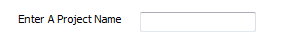
When the form control is applied the name entered will display as the caption for the form control. This can be changed by selecting the Caption property
Properties
Appearance
Appearance - Border
Appearance - Caption
Appearance - Text
- Font
Specifies the font of the text shown in the control.
- Text Color
Specifies the color of the control's text.
- Text Color (Disabled)
Specifies the color of the control's text when the control is disabled.
- Text Color (Focus)
Specifies the color of the control's text when the control is in a focused state.
- Text Color (Hover)
Specifies the color of the control's text when the control is in a hovered state.
- Text Horizontal Alignment
Controls whether the text is horizontally aligned to the left, right or center
Behavior
- Character Limit
Limits the number of characters that can be entered in the control. If set to 0, any number of
characters can be entered.
- Default Value
Controls the default value of the control. If the default value is based on a rule and the value
changes, then the value of the control will be changed to be the new default value.
- Enabled
Controls whether the control is enabled (if the result is TRUE) or disabled (if the result is
anything other than TRUE, e.g. FALSE).
- Error Result
Determines whether the value of the control is in error. The result of this rule is a string
containing the error message if the value is in error, otherwise a blank string or the number zero.
- Maximum
The maximum value that can be selected on the control.
- Minimum
The minimum value that can be selected on the control.
- Multiline
Specifies whether the text box is multi-line (TRUE) or single line (FALSE).
- Read only
Prevents the text from being edited but still allows for text selection and scrolling.
- Tab Index
Configures the position of the control in the form tab order.
- Text
Specifies the text shown in the control.
- Text (Override Rule)
Specifies the text shown in the control.
- Visible
Determines whether the control is visible (TRUE) or hidden (FALSE).
Events
General
- (Metadata)
Optional text which can be used to provide information belonging to or about a control. For example,
a list of CSS classes which can be parsed and applied to the control using the Integration Theme in
DriveWorks Live. This doesn't affect the control's behavior.
- (Name)
The name of the control
- (Tag)
Optional text which can be used to describe the control, but which doesn't affect the control's
behavior.
- Tooltip Duration
Controls the duration, in seconds, for which the tooltip will remain visible. Values of 0 and below
indicate an infinite duration.
- Tooltip Text
Specifies the text to display in a tooltip when hovering over the control.
Layout
- Caption Width
Controls the width of the control's caption.
- Height
Controls the height of the control.
- Left
Controls the left position of the control.
- Top
Controls the top position of the control.
- Width
Controls the width of the control.
Additional Resources
MyDriveWorks - Tech Tips
Default Value Rule
This Project demonstrates the differences between the Default Value and Override Value properties on your Controls.
Tech Tips Index
View all available MyDriveWorks Tech Tips.
DriveWorks Tech Tips Index
A user form control that will accept alpha and numeric
entries.