Appearance
- Background Color
Specifies the color of the control's background.
- Canvas Background Color
The background color for the canvas. This is not saved in the HTML output from this control.
The TinyMCE Control displays a rich text editor on a User Form for textual input that supports image upload.
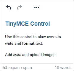
This allows detailed notes or comments, along with accompanying links and images, to be written from a Specification.
This control has many uses, including:
The result of any data entered in the Control is written to the Text Property.
This can be referenced in a rule using <ControlName>Return.
The result is formatted HTML.
For example text written and formatted in the TinyMCE control could return the following HTML:
<h1>Notes</h1> <p>When delivering <item> please contact <strong>reception</strong>.</p>
Any characters that can be misinterpreted in HTML are automatically escaped.
From the above example <item> is rendered as <item> in the control and in any browser.
Specifies the color of the control's background.
The background color for the canvas. This is not saved in the HTML output from this control.
The default text color for the canvas. This is not saved in the HTML output from this control.
The max input limit in bytes. Limits everything, including characters, HTML entities and images.
Limits the number of characters that can be entered in the control. If set to 0, any number of characters can be entered.
Controls the default value of the control. If the default value is based on a rule and the value changes, then the value of the control will be changed to be the new default value.
Determines how duplicate uploaded files should be handled.
Determines the UI/UX of the TlnyMCE control.
Controls whether upload is enabled (TRUE) or disabled (FALSE).
Controls whether the control is enabled (if the result is TRUE) or disabled (if the result is anything other than TRUE, e.g. FALSE).
Determines whether the value of the control is in error. The result of this rule is a string containing the error message if the value is in error, otherwise a blank string or the number zero.
Specifies the HTML shown in the control.
An Absolute path, or path relative to the project file, or the language pack to use.
The name of the macro to call when uploading of a file is complete. The macro's argument will be the name of this control.
Specifies the placeholder text to display in the control when it is empty. If no value is provided, no placeholder text will be shown.
Configures the position of the control in the form tab order.
The directory path to use for uploaded files. It is possible to use prefixes such as <Project>
Error message text shown when the image upload is disabled and users attempt to upload an image.
The limit on the size of the image that can be uploaded. The units can be specified, or bytes will be assumed.
The filter to use when picking an image to upload. E.g. png|jpg
Determines whether the control is visible (TRUE) or hidden (FALSE).
Optional text which can be used to provide information belonging to or about a control. For example, a list of CSS classes which can be parsed and applied to the control using the Integration Theme in DriveWorks Live. This doesn't affect the control's behavior.
The name of the control
Optional text which can be used to describe the control, but which doesn't affect the control's behavior.
Controls the duration, in seconds, for which the tooltip will remain visible. Values of 0 and below indicate an infinite duration.
Specifies the text to display in a tooltip when hovering over the control.