Numeric Text Box
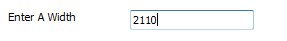
The Numeric Text Box displays a box in which numeric values can be entered. Limits can be set for the value entered by setting the Maximum and Minimum properties.
When a value is entered, the form control reports the value as it appears in the control.
When the form control is applied the name entered will display as the caption for the form control. This can be changed by selecting the Caption property.
Properties
Appearance
Appearance - Border
Appearance - Caption
Appearance - Text
- Font
Specifies the font of the text shown in the control.
- Text Color
Specifies the color of the control's text.
- Text Color (Disabled)
Specifies the color of the control's text when the control is disabled.
- Text Color (Focus)
Specifies the color of the control's text when the control is in a focused state.
- Text Color (Hover)
Specifies the color of the control's text when the control is in a hovered state.
- Text Horizontal Alignment
Controls whether the text is horizontally aligned to the left, right or center
Behavior
- Decimal Places
Controls the number of decimal places shown in the control. If the value is set to a negative value,
DriveWorks automatically determines the required number of decimal places.
- Default Value
Controls the default value of the control. If the default value is based on a rule and the value changes,
then the value of the control will be changed to be the new default value.
- Display Value
Provides access to the native value of the control.
- Enabled
Controls whether the control is enabled (if the result is TRUE) or disabled (if the result is anything other
than TRUE, e.g. FALSE).
- Error Result
Determines whether the value of the control is in error. The result of this rule is a string containing the
error message if the value is in error, otherwise a blank string or the number zero.
- Maximum
The maximum value that can be selected on the control.
- Minimum
The minimum value that can be selected on the control.
- Tab Index
Configures the position of the control in the form tab order.
- Visible
Determines whether the control is visible (TRUE) or hidden (FALSE).
Events
General
- (Metadata)
Optional text which can be used to provide information belonging to or about a control. For example, a list
of CSS classes which can be parsed and applied to the control using the Integration Theme in DriveWorks Live.
This doesn't affect the control's behavior.
- (Name)
The name of the control
- (Tag)
Optional text which can be used to describe the control, but which doesn't affect the control's behavior.
- Tooltip Duration
Controls the duration, in seconds, for which the tooltip will remain visible. Values of 0 and below indicate
an infinite duration.
- Tooltip Text
Specifies the text to display in a tooltip when hovering over the control.
Layout
- Caption Width
Controls the width of the control's caption.
- Height
Controls the height of the control.
- Left
Controls the left position of the control.
- Top
Controls the top position of the control.
- Width
Controls the width of the control.
Please note, when setting the Display Value property of the Numeric Text Box, from Static to Dynamic. It will no longer adhere to the following properties. It will use the default settings.
A user form control that accepts numeric values only.
A user form control that accepts numeric values only.