Appearance
- Background Color
Specifies the color of the control's background.
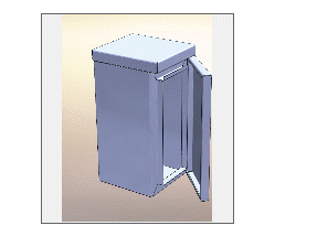
The Picture Box displays an image on the user form. The image can be static or it can dynamically change based on the results of another form control or rule.
For a list of image file types the Picture Box supports see the File Name property topic.
Specifies the color of the control's background.
Specifies the color of the control's outer border when the 'SingleLine' border style is selected.
Specifies the border radius of the control.
Specifies the border radius of the control when in a hovered state.
Configures the border style of the control.
Specifies the width of the control's border.
An absolute path, or path relative to the project file, of the picture to show.
The picture to be shown when the control is in a hover state.
Controls how the picture is sized within the picture box.
Controls whether the control is enabled (if the result is TRUE) or disabled (if the result is anything other than TRUE, e.g. FALSE).
Determines whether the value of the control is in error. The result of this rule is a string containing the error message if the value is in error, otherwise a blank string or the number zero.
Configures the position of the control in the form tab order.
Determines whether the control is visible (TRUE) or hidden (FALSE).
Optional text which can be used to provide information belonging to or about a control. For example, a list of CSS classes which can be parsed and applied to the control using the Integration Theme in DriveWorks Live. This doesn't affect the control's behavior.
The name of the control
Optional text which can be used to describe the control, but which doesn't affect the control's behavior.
Controls the duration, in seconds, for which the tooltip will remain visible. Values of 0 and below indicate an infinite duration.
Specifies the text to display in a tooltip when hovering over the control.
A user form control that will display an image.