Item List
The Item List displays a list from which dialog forms can be launched that allow supplementary items to be specified.
The dialogs to launch and the information on the dialog forms that is to be passed into the item list control are set by the Items property.
When the form control is applied the name entered will display as the caption for the form control. This can be changed by selecting the Caption property.
Properties
Appearance
- Background Color
Specifies the color of the control's background.
- Column Widths
One or more values delimited by the | symbol. Setting one value applies that width to all columns.
- Name Column Visible
Specifies whether the name column is visible or not.
- Show Filler Column
Appends a filler column at the end of each row to fill the remaining control width. If set to FALSE, the final column of data will expand to fill the remaining control width, regardless of a column width specified.
- Type Column Visible
Specifies whether the type column is visible or not.
Appearance - Caption
Appearance - Text
Behavior
- Enabled
Controls whether the control is enabled (if the result is TRUE) or disabled (if the result is anything other than TRUE, e.g. FALSE).
- Error Result
Determines whether the value of the control is in error. The result of this rule is a string containing the error message if the value is in error, otherwise a blank string or the number zero.
- Hidden Item Values
A pipe-bar delimited list of Item Value columns which should not be displayed in the Item List.
- Items
One or more dialog names, delimited by the | symbol, which control which items can be added to the item list.
- Tab Index
Configures the position of the control in the form tab order.
- Task List Enabled
Specifies whether to enable the task list for a dialog.
- Visible
Determines whether the control is visible (TRUE) or hidden (FALSE).
General
- (Metadata)
Optional text which can be used to provide information belonging to or about a control. For example, a list of CSS classes which can be parsed and applied to the control using the Integration Theme in DriveWorks Live. This doesn't affect the control's behavior.
- (Name)
The name of the control
- (Tag)
Optional text which can be used to describe the control, but which doesn't affect the control's behavior.
- Tooltip Duration
Controls the duration, in seconds, for which the tooltip will remain visible. Values of 0 and below indicate an infinite duration.
- Tooltip Text
Specifies the text to display in a tooltip when hovering over the control.
Layout
- Height
Controls the height of the control.
- Left
Controls the left position of the control.
- Top
Controls the top position of the control.
- Width
Controls the width of the control.
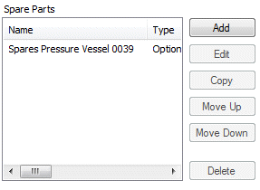
A user form control that allows items to be added to the
specification.